3.3: Create Maps
Objective:
In this lab, you will create maps from the web logs sample data.
-
Open the Logs Overview dashboard.
- Make sure to view the Last 7 days of data.
- Click the Edit button. Note: If the dashboard is already in Edit mode, you'll see a Save button instead.
-
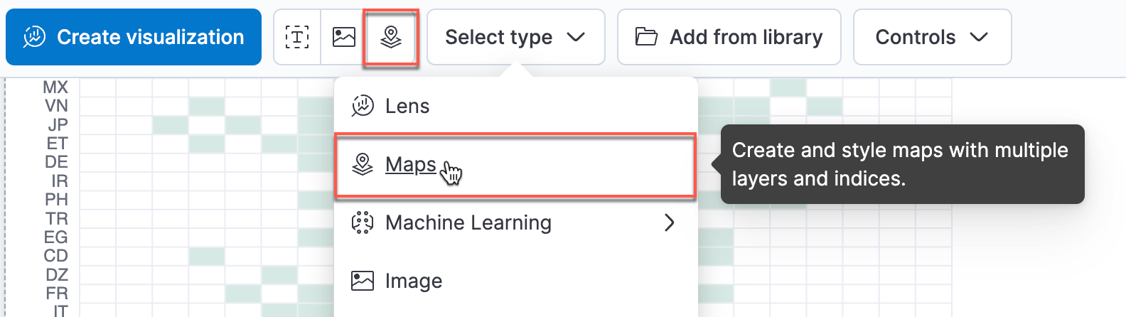
Click the Select type drop down, and then select Maps or click the Map icon to create a map visualization.
-
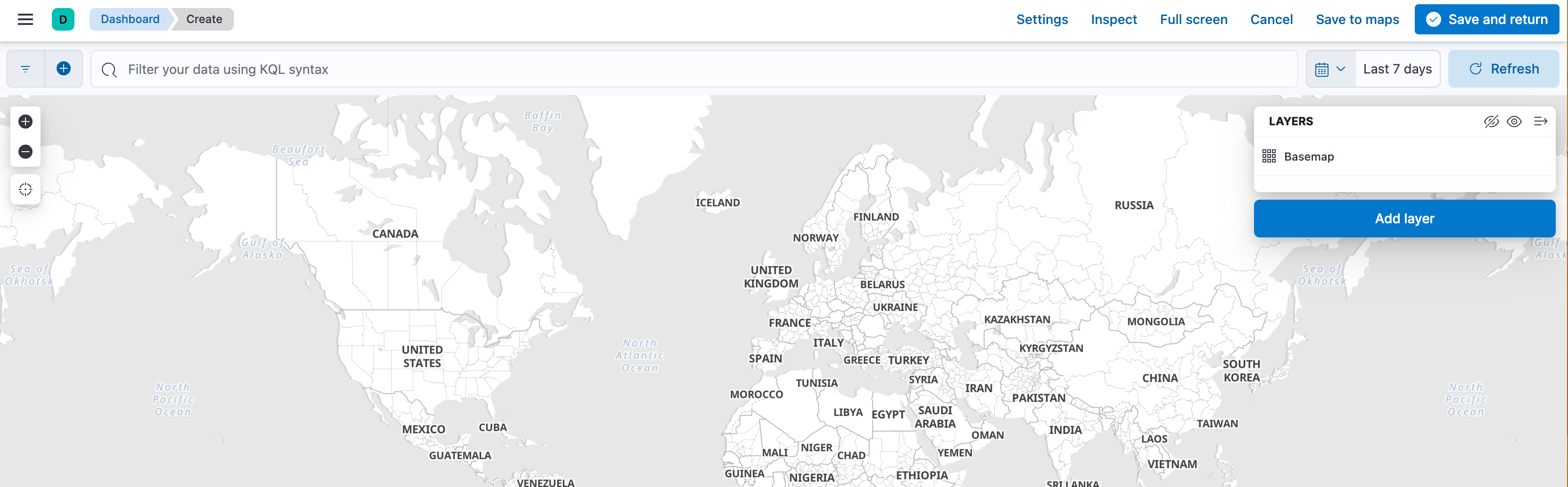
You're presented with a single world map, with Basemap as the base layer. Let's add a layer by clicking the Add layer button.
-
We are going to overlay regional data based on a count of records. Click the Choropleth button.

-
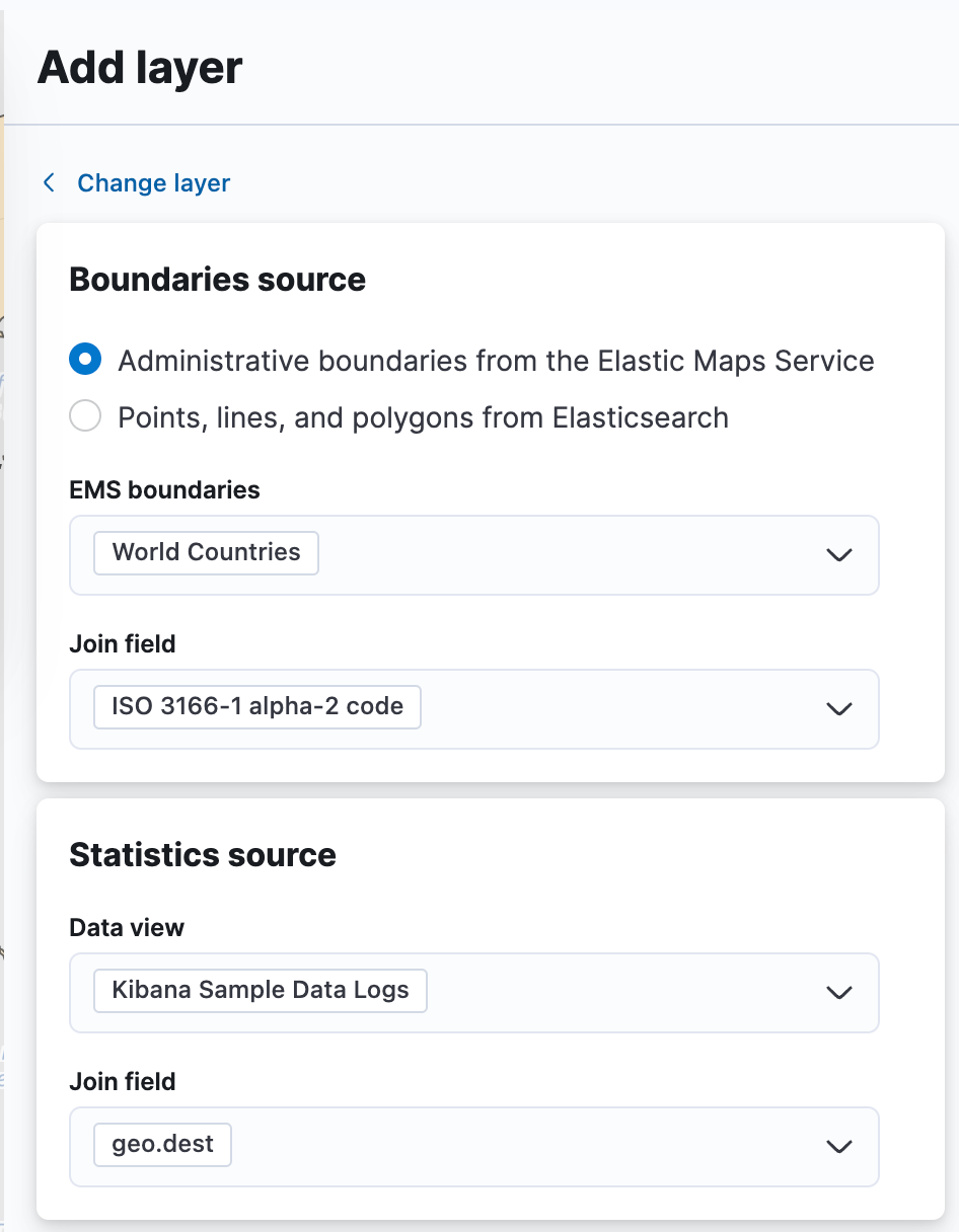
We will use the Administrative boundaries from Elastic Maps Service and use World Countries for the EMS boundaries.
-
The Join field will appear, and we'll use the default ISO 3166-1 alpha 2-code.
-
In the Statistics source section:
- Select Kibana Sample Data Logs as the data view.
- Select geo.dest for the Join field.
- Click Add and continue.
-
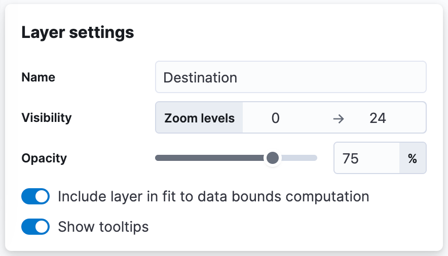
For the Layer settings, set the Name to Destination.
-
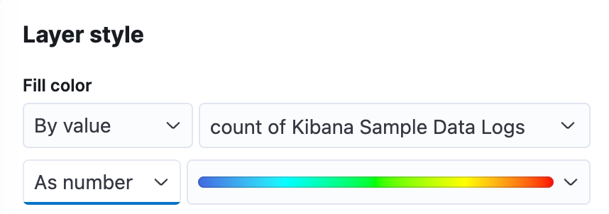
Scroll down to the Layer style section, verify that the Fill color is set to count of Kibana Sample Data Logs and set the color selection to use the rainbow color ramp.
-
Click Keep changes in the layer editor and then Save and return to your dashboard.

-
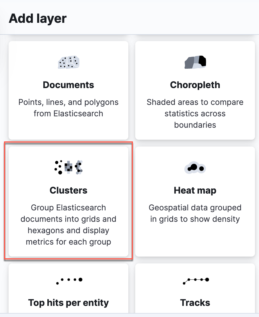
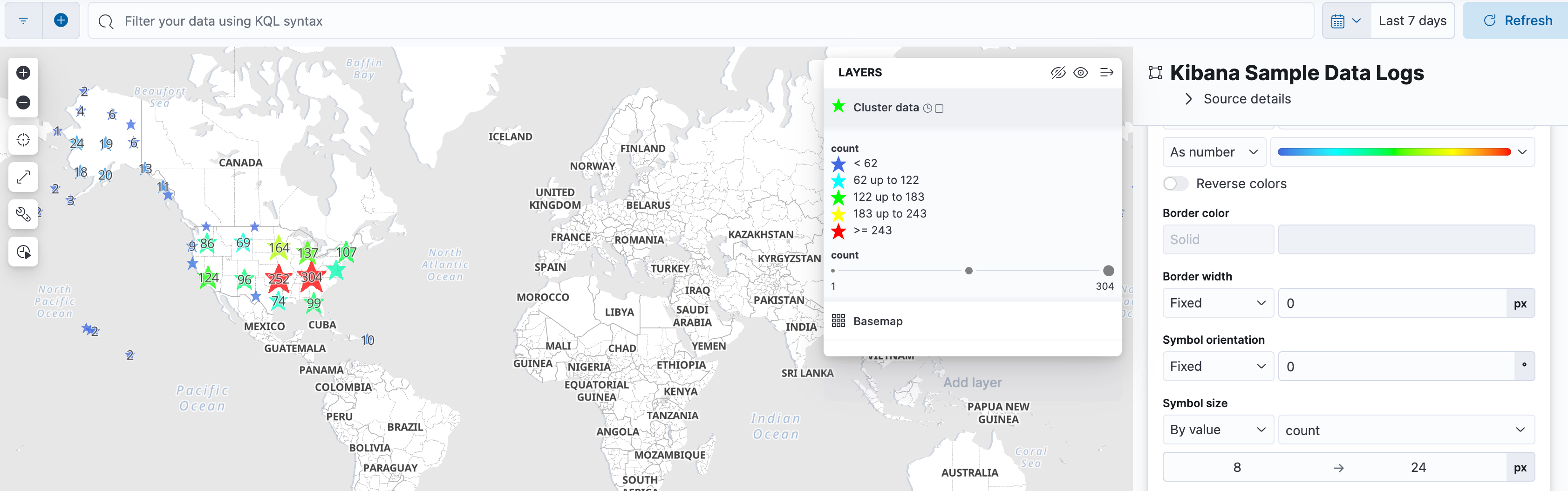
Next, let's create another map that displays metrics in a grouping by clusters. Click the Map icon to create another map.
-
Click Add layer and this time select Clusters.
-
Select Kibana Sample Data Logs as the Data view and
geo.coordinatesas the Cluster field. Click Add and continue.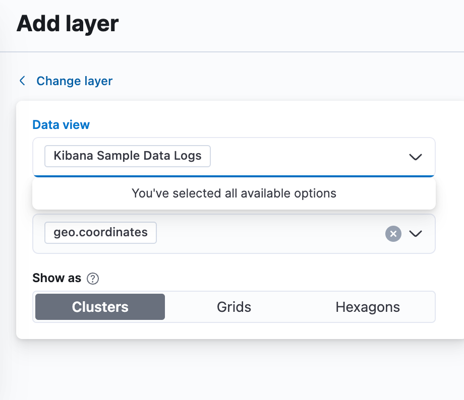
-
Name the Layer Cluster Data.
-
Under Metrics click Add metric and specify the following:
- average for Aggregation
bytesfor Field
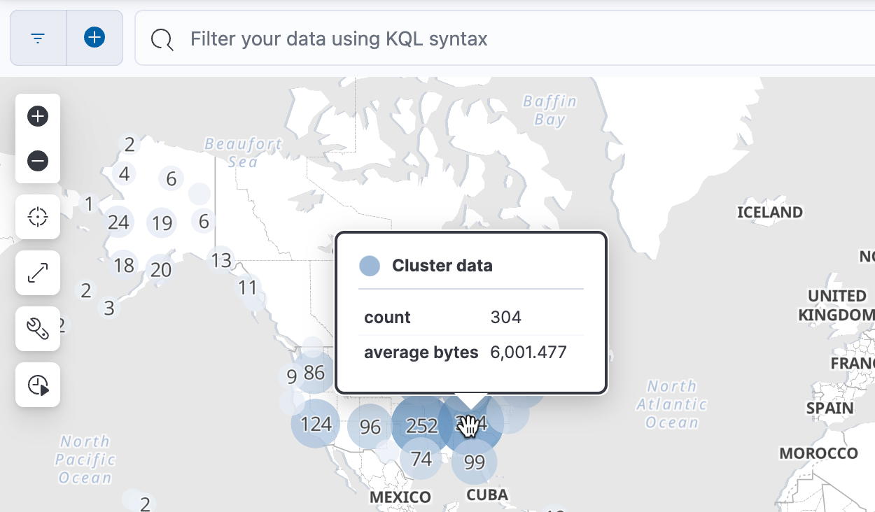
Notice when you hover your mouse over the map, the toolip displays two metrics: count and average bytes.
-
Under Layer style, change some of the styles such as the symbol type, colors, and borders. When you are done, click Save and return to return to the dashboard.
-
This is a good time to save your dashboard. Click Save. After saving your dashboard, click Switch to view mode to exit out of the edit mode.
Summary:
In this lab, you created two different types of maps.