1: Dashboard setup
Objective:
This lab and the following two parts are optional labs. You will use what you learned during this class to analyze and hunt anomalies from a new dataset. In this first part, you will learn about a new dataset elasticlogs.
-
Create a data view for
elasticlogsif you don't already have one. Use@timestampfor the time field. -
Use Discover to explore
elasticlogs. What date range is the data from?Show answer
Go to Discover. Play with the time filter until you find a range where data exists. For example, you can use "Last 5 year".

Notice that there are 123019 documents. Now you can zoom in closer to the time range that contains the data by clicking and dragging over the bars. The data is for the month of August 2021.

-
Create a new dashboard. Create a date histogram that shows the count of documents grouped by
response. Save the dashboard with the time range you found in Step 2 and call itElastic logs. It should look like the image below.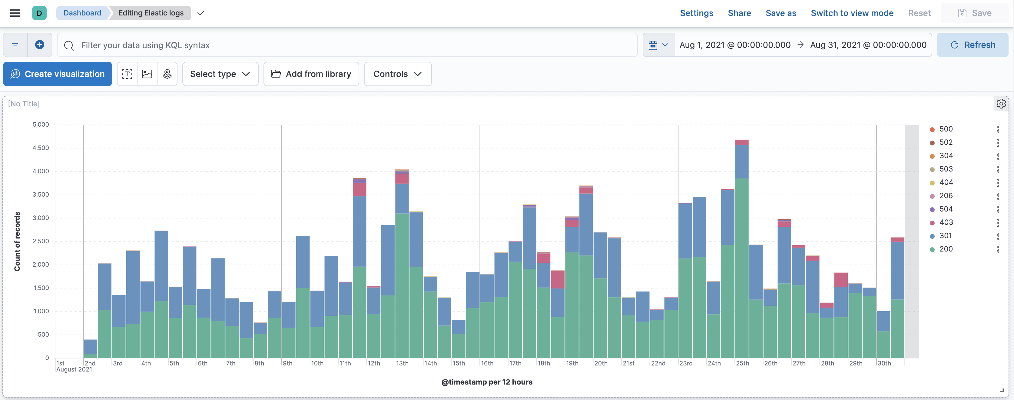
Show answer
Go to Dashboard. Create a new dashboard. Click on Create visualization to go to Lens.
Drag Records to the workspace.

Drag response to the workspace.

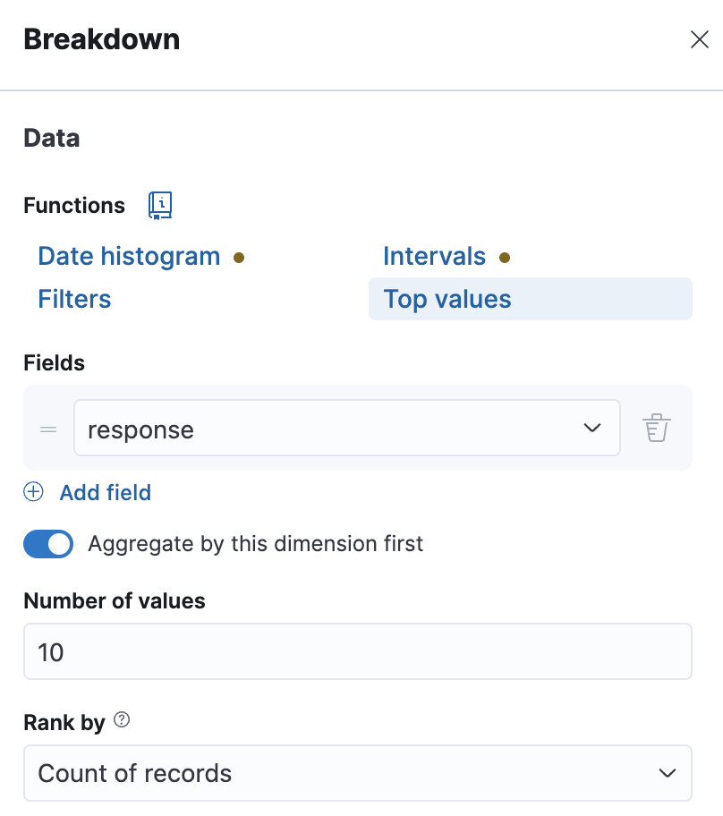
Click on Top 3 values of response and change the Number of values to 10.
Click Save and Return.
-
Create a map with two layers:
- One layer has the world countries using EMS boundaries color filled by the count. Use the field
geoip.country_iso_code. Add a tooltip for the country name and iso-code-2 fields. - The other layer is above the first layer. It displays the clusters of the geo locations in the field
geoip.location.
Add the map to the dashboard
Elastic logsand save. The dashboard should now look like the image below.
Show answer
Create a new map. Select EMS Boundaries.

Select World countries, and click Add and continue

Go to Term joins and click Add join.
Join ISO 3166-1 alpha-2 code with geoip.country_iso_code.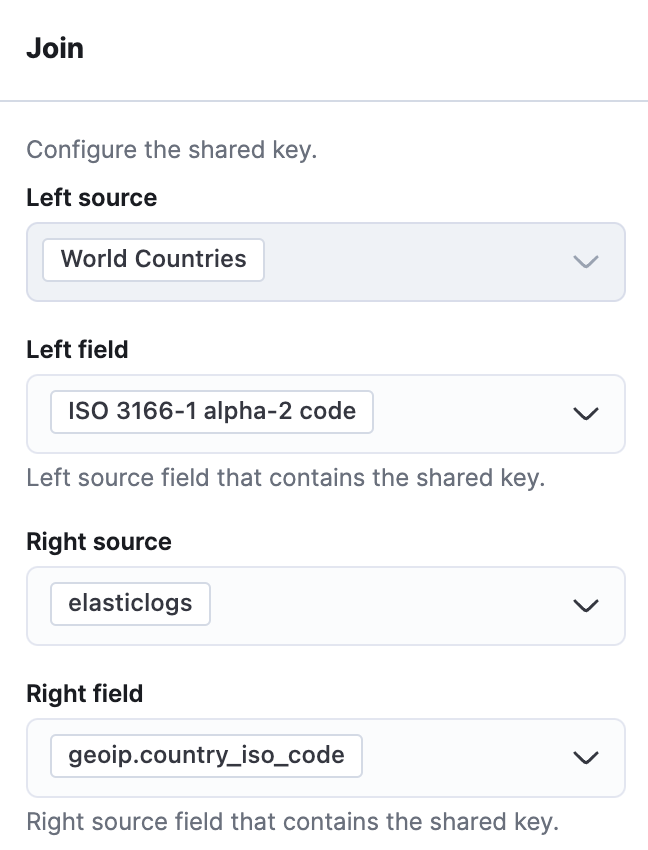
Go to Fill color and change it to By value and select count of elasticlogs. You can also change the color scheme if you want.

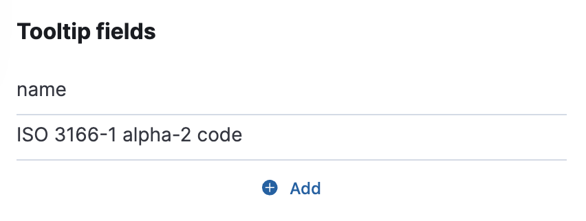
Click Add under Tooltip fields. Select name and ISO 3166-1 aplpha-2 code. Change the order by sliding a field up or down.
Click Keep changes. Your map should now look like the image below.

Add a new layer. Select Clusters. Select the index pattern
elasticlogsthen the fieldgeo.locationshould be selected automatically for you.
Click Add layer. Then Close. Save and Return to your dashboard. Save your dashboard.
- One layer has the world countries using EMS boundaries color filled by the count. Use the field
-
What type of categories are there? Add a donut visualization of the top 5 categories to the dashboard. Use the
blog_categoryfield. The graph should look like the image below.
Show answer
Click Create visualization to go to Lens. Drag and drop the
blog_categoryfield into the workspace. Select the donut chart from either the Suggestions list or the Visualization type drop-down menu.
Save and Return to your dashboard. Save your dashboard.
Alternatively, you could go to Discover, click on the field
blog_categoryon the fields list then click Visualize. That will also take you to Lens. You can then select the donut chart from the Suggestions list then Save and Return.There are five categories: Engineering, News, Releases, User Stories, and Culture.
-
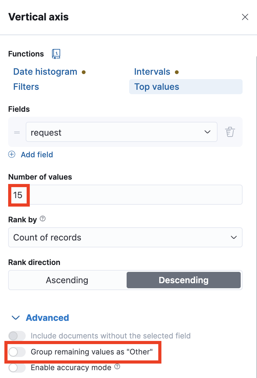
Which blog had the most visitors? Add a horizontal bar chart of the top 15 most visited blogs. Use the
requestfield for the name of the blog. The graph should look like the image below.
Show answer
Click Create visualization to go to Lens. Drag and drop the
requestfield into the workspace. Select Bar horizontal from the Visualization type drop down menu.
Click on Top values of request and change the Number of values to 15. Click Advanced and disable Group other values as "Other".
Save and Return to your dashboard. Save your dashboard.
The blog "Welcome Insight-IO to the Elastic team" had the most visitors by far.
-
Feel free to resize and rearrange the visualizations as you like. This dashboard is for you to use so make it convenient for you. If you think of other visualizations you want, you can add them here as well. Don't forget to Save your changes.
Summary:
In this lab, you set up a dashboard for the Elastic logs. Now you're ready to start asking and answering some questions about this dataset.