1.1: Intro to Kibana
Objective:
In this lab, you will load the sample data that ships with Kibana and take a look at some of the features of Kibana.
-
In your Strigo lab environment, click the Terminal button in the toolbar and open a new Terminal tab by clicking on the
+icon.
-
Your lab environment has the Elastic Stack already up and running. It consists of a 1-node Elasticsearch cluster along with a Kibana instance connected to the cluster. You can access this Kibana instance by clicking the Kibana button in your lab environment toolbar. When the Kibana login page appears, provide the following credentials:
- Username:
training - Password:
nonprodpwd
- Username:
-
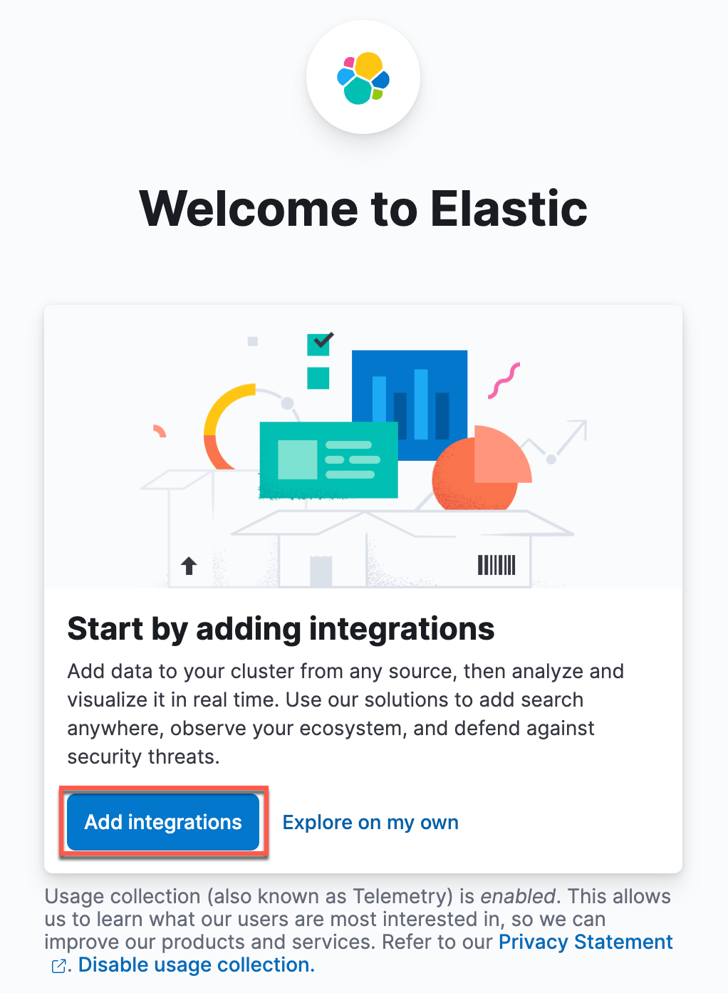
Since the Elasticsearch cluster contains no data, you will be prompted with a Welcome page, click on Add integrations to start adding sample datasets:
-
In the resulting Integrations page, search for “Sample data” and you should find a card that you can click on to load sample data sets.

-
Expand Other sample data sets at the bottom of this page.

-
You should see three sample data sets:
- eCommerce orders
- flight data
- web logs
Let's add all the three datasets by clicking on the button Add data!

-
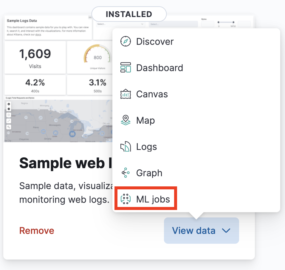
Once the sample data sets have been installed, click on View data on the Sample web logs card and you should see a drop down menu with several options. This dataset includes several items to check out. Let's begin by clicking on Dashboard icon.

-
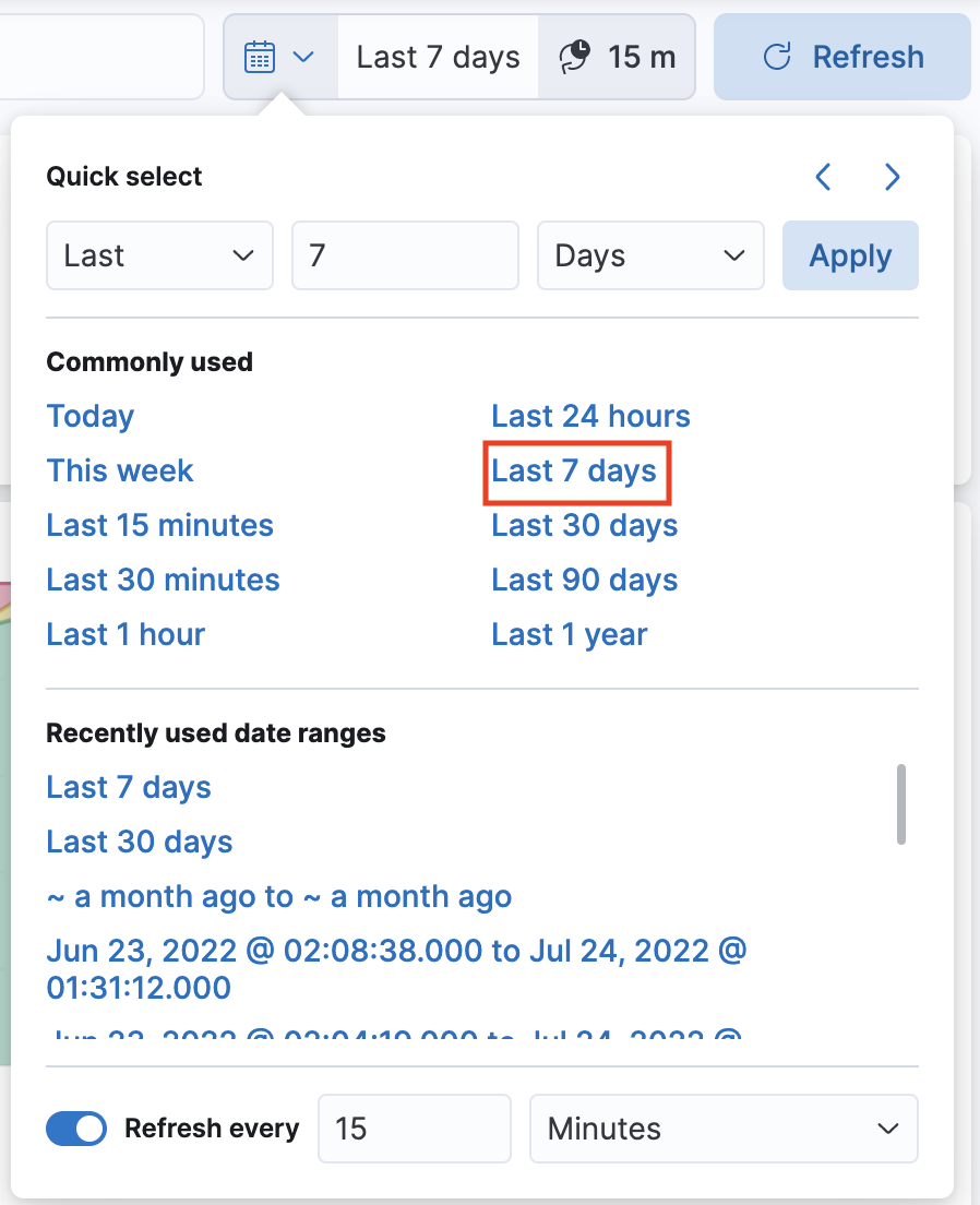
Before you start exploring the content of the dashboard, take a look at your time filter. You can find the time filter on the top right corner near the Refresh button. The time filter should automatically be set to last 7 days. If it’s set to a different value click the calendar symbol to set the time filter to Last 7 days on the list of Commonly used date ranges.
-
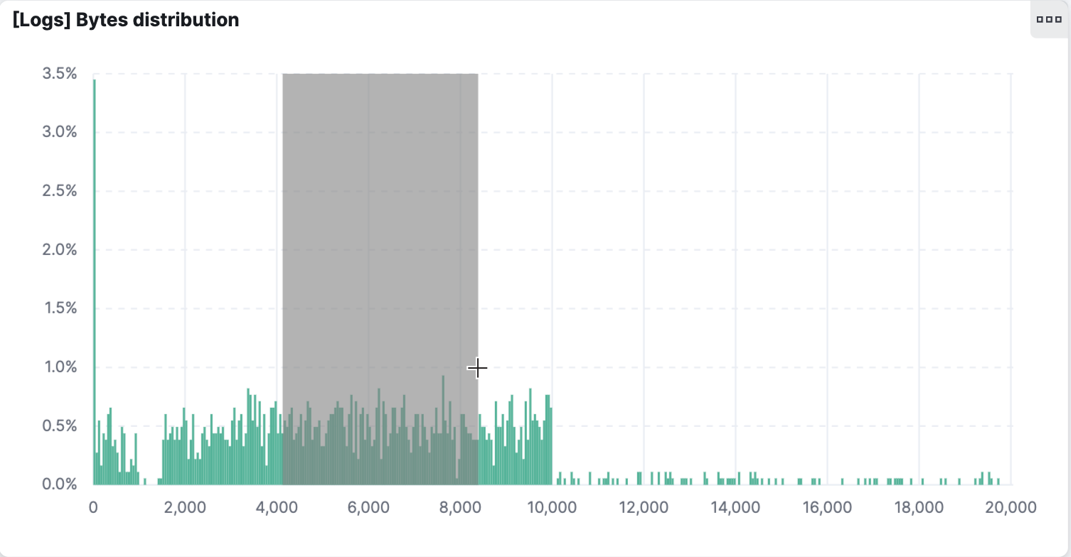
Your dashboard contains different types of visualizations. Some are interactive. Hover your mouse over all the panels to see which ones react to your action and which ones don't. Depending on which editor was used to build the visualization, they may have other available mouse actions. Go to the bar chart [Logs] Bytes distribution. Hovering over any bar will show a tooltip with the relevant values for that bar.
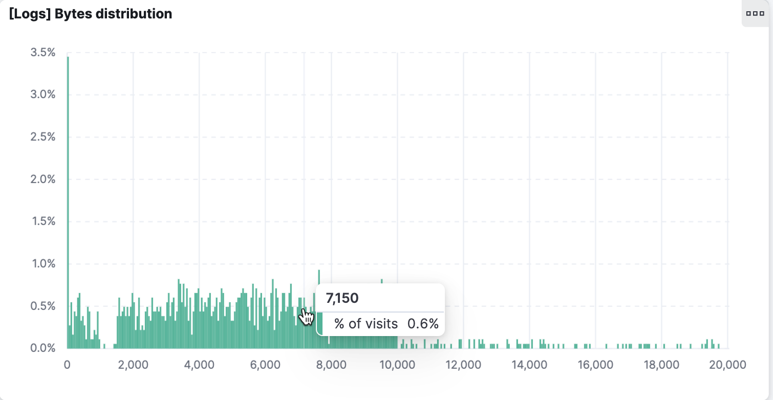 Next click and drag across several bars. When you release the mouse button, you'll notice the bar chart has changed – and so have all the other visualizations.
-
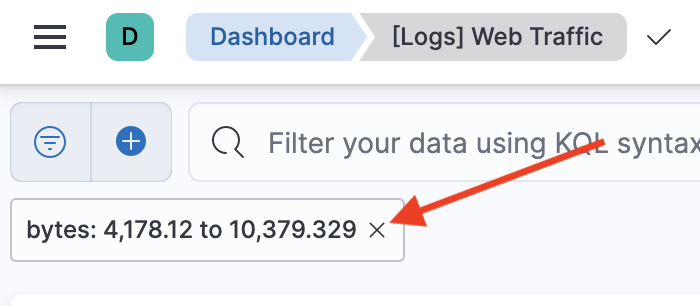
Scroll up to the top of the dashboard. Notice that your click and drag action created a filter, which is shown in the top left, just below the query bar. Hover over the filter and click x to delete the filter.
-
This bar chart was created through a visualization editor called Lens. We will spend a lot of time getting to know Lens in this course starting with the next lesson and learn many more advanced features of Lens in future modules. Similarly, we can change the view of the data set in other ways. Go to the map visualization titled [Logs] Total requests and bytes. Click the tools (wrench icon) icon and select Draw distance to filter data.
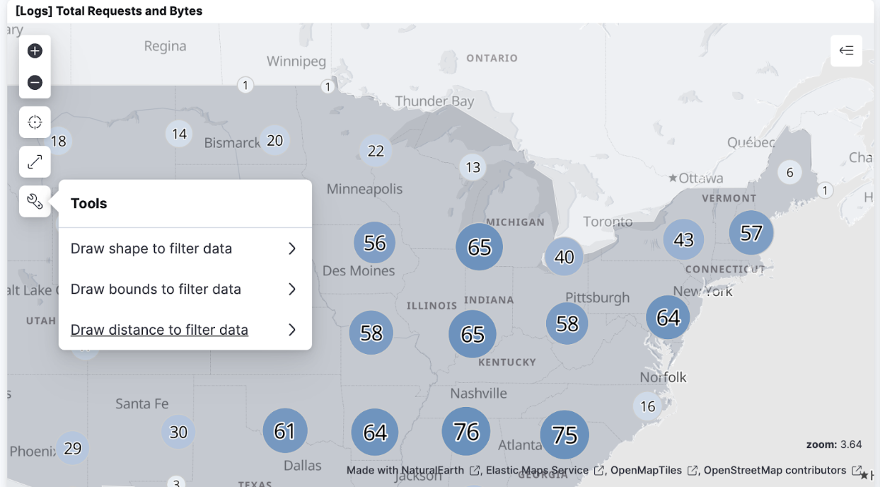 Name the filter "disc" and click Draw distance. This will present you with a crosshair. Click anywhere on the map of the United States, then as you move the crosshair away you can see a circular area with a radius equal to the movement being selected in the map. Click again to complete your selection.
You filtered the web logs dataset to find only those users located within the circular bound you just highlighted. This map uses a visualization editor called Maps. We will learn about Maps in future modules.
We will also talk about other interactive behaviors that can be added to dashboards, and how to share dashboards with your colleagues in later modules.
Name the filter "disc" and click Draw distance. This will present you with a crosshair. Click anywhere on the map of the United States, then as you move the crosshair away you can see a circular area with a radius equal to the movement being selected in the map. Click again to complete your selection.
You filtered the web logs dataset to find only those users located within the circular bound you just highlighted. This map uses a visualization editor called Maps. We will learn about Maps in future modules.
We will also talk about other interactive behaviors that can be added to dashboards, and how to share dashboards with your colleagues in later modules. -
Now let's take a look at some additional objects that the Kibana team has created for the web logs dataset. From the Kibana menu open the Canvas editor by clicking on:
- > Analytics > Canvas
-
Select the workpad titled "[Logs] Web Traffic". To view this workpad in fullscreen mode, you can click View -> Enter fullscreen mode or the button to enter fullscreen mode on the top right of this workpad. Notice that this is very different from Dashboard in terms of utility. The visualizations are not meant to be interactive. This is great for creating pixel perfect presentations of your live data. However, Canvas is not meant to be used for deep exploration of the data. We will talk about Canvas later in this course.
-
Next let's explore how to create a machine learning job. Go back to the home page by clicking on:
- > Home
-
Select Try sample data (next to Add integrations) and then expand the Other sample data sets menu at the bottom of the page. Select ML jobs from the Sample web logs data set.
 Kibana ships with many pre-built machine learning jobs for known data. This is true for the sample data sets as well. Kibana has already recognized the job that is appropriate for our sample log data and has displayed it here in this wizard. All you have to do is start this job. Enter a value for job ID prefix (
logs-prebuilt-) so that you can identify these jobs easily later and click Create jobs.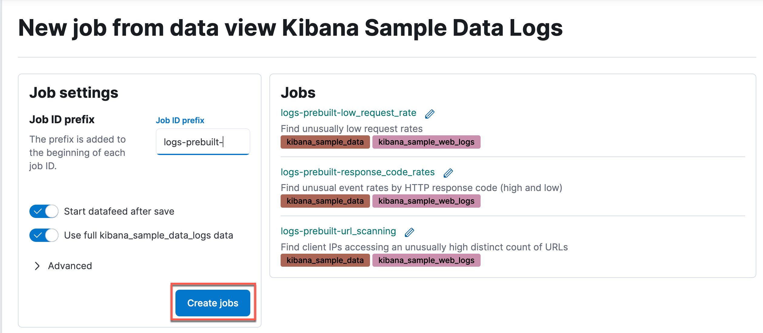
-
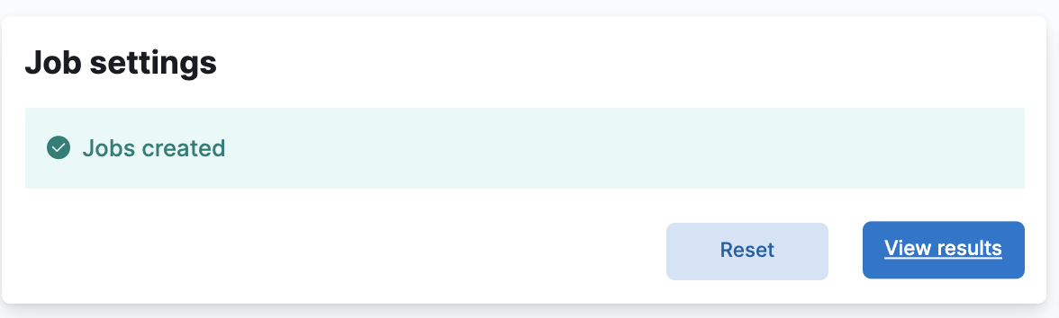
Click View results.
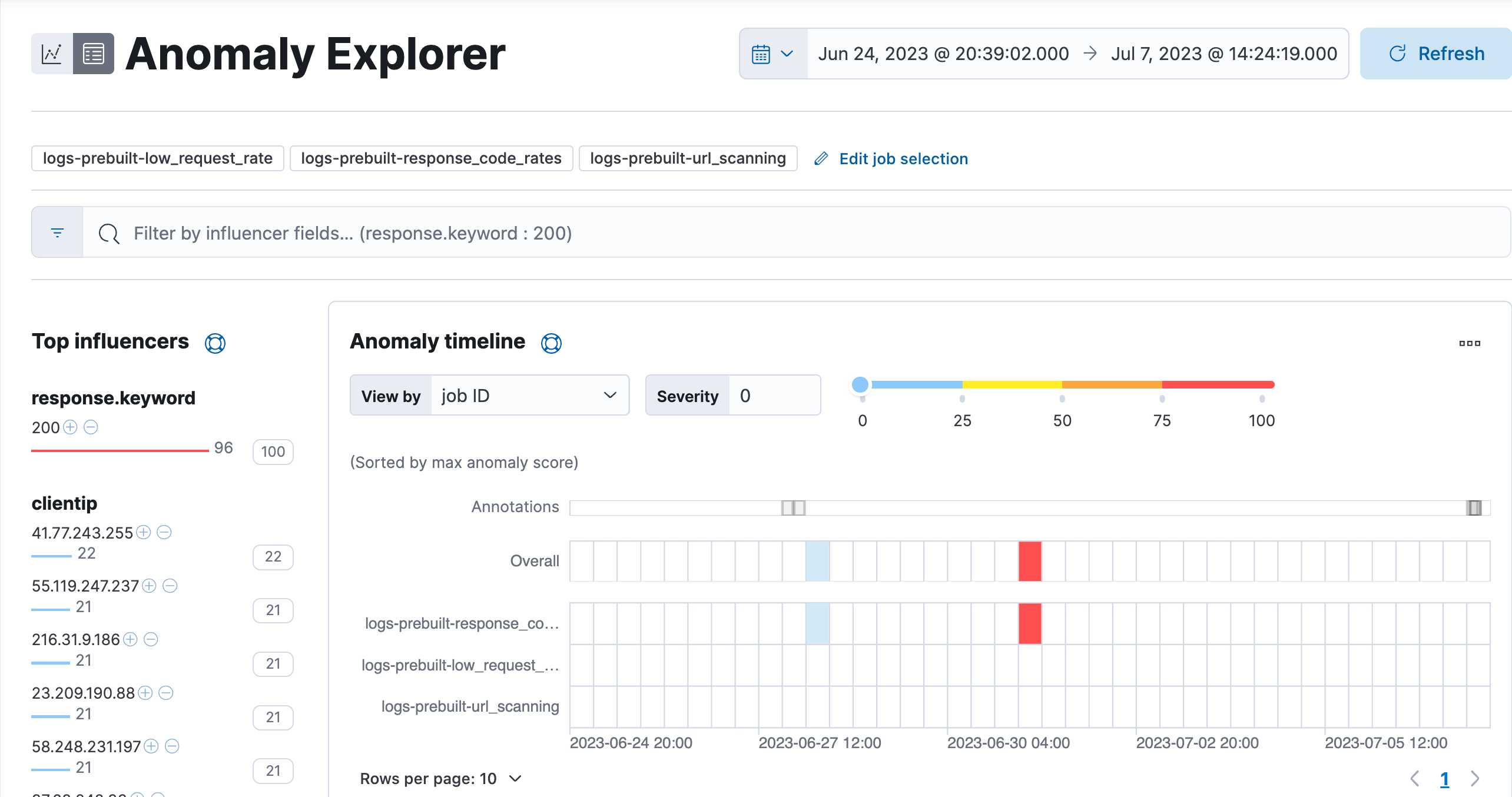
 The Anomaly Explorer displays a few of the anomalies that your ML jobs have detected. We will learn more about how to understand the Anomaly Explorer and other ML tools in a later module.
-
That's all for now. Hopefully you are starting to get comfortable navigating Kibana. In the next lesson you will build your very own dashboard from scratch.
Summary:
In this lab, you installed all of the sample data sets that ships with Kibana. You also saw some of the features of Kibana by exploring the visualizations that loaded with the sample data. In the next lab, you will learn how to build your own dashboard.