7.1: Formulas
Objective:
In this lab, you will use formulas to visualize the results of math operations on your data.
-
The sample logs contain a response field that indicates whether a request was handled successfully or not. Successful requests result in a response code in the 200s or 300s (for example, 200 or 301). Errors result in a response code in the 400s or 500s (for example, 404 or 501). Let's use
Formulasin Lens to plot the percentage of errors over time. To do that, open Discover and make sure the Kibana Sample Data Logs data view is selected and time interval Last 7 days is select as well. -
Write a KQL query to find all logs related to error messages? Note: There are multiple ways to achieve this, follow the example if needed.
-
Now open your Logs Overview dashboard, switch to edit mode if necessary, and click on Create visualization.
-
Drag the Records field on to the workspace and change the visualization type into a line chart.
-
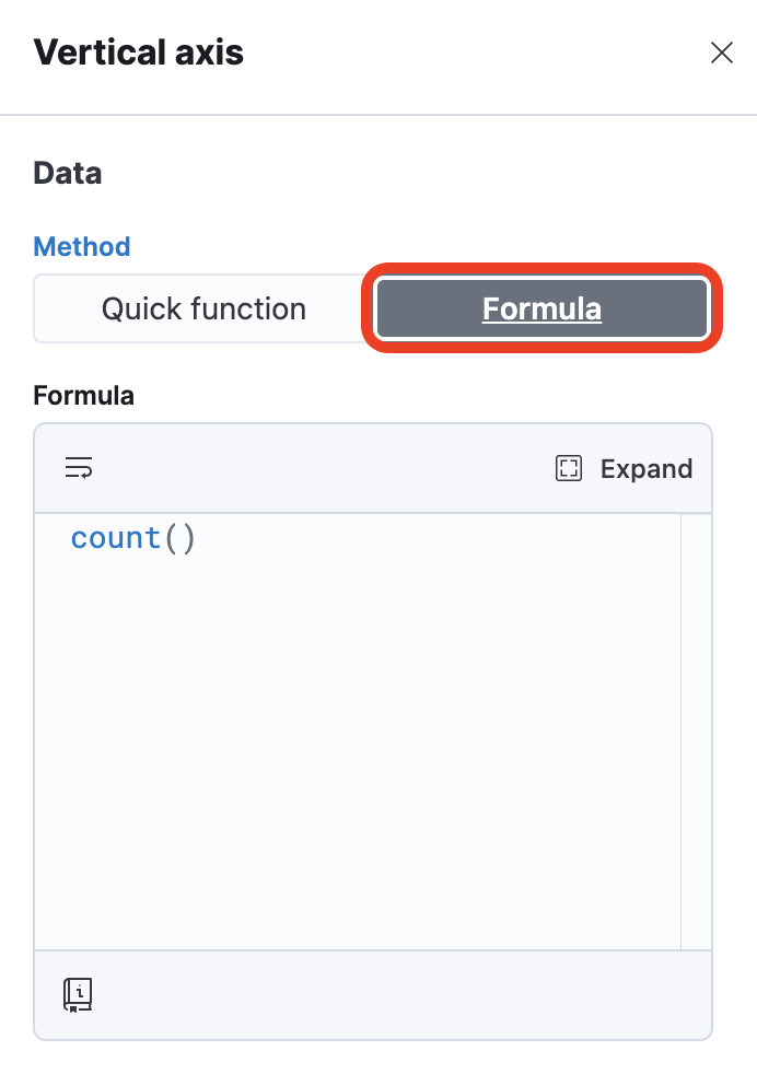
Click Count of records on the right. Under "Vertical axis", select the Formula tab.
-
You will see the
count()function already there. Let's modify now this function so it only returns the number of errors, rather than the count of all requests. Like our previous query, you can pass akqlargument to thecount()function. Do this by replacing the formula withcount(kql='response>399'). -
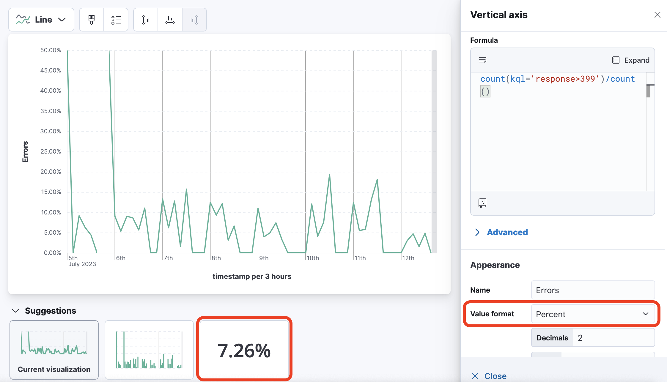
Set the Name field to
Errorsinstead ofcount(kql='response>399'). -
The current formula returns the absolute number of errors. Change the formula so it returns the fraction of errors, that is, the number of errors divided by the total number of requests. Use the help if needed.
-
Change Value format to Percent. Your chart now shows the percentage of errors over time:
-
Click Save and return to add the visualization to your dashboard. Next, save the dashboard.
Summary:
In this lab, you used formulas to visualize the results of math operations on your data.