3.1: Create Visualizations
Objective:
In this lab, you will add visualizations to your dashboard for the web logs sample data.
-
Open the Logs Overview dashboard. If the Logs Overview dashboard is not created, you can also complete this lab using the "[ Logs ] Web Traffic" dashboard
- Make sure to view the Last 7 days of data.
- Click the Edit button. Note: If the dashboard is already in Edit mode, you'll see a Save button instead.
-
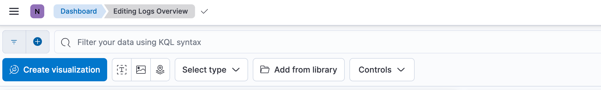
Click Create visualization. This will open the Lens editor by default.
-
Drag the
response.keywordfield to the workspace. This gives you a Bar vertical stacked graph.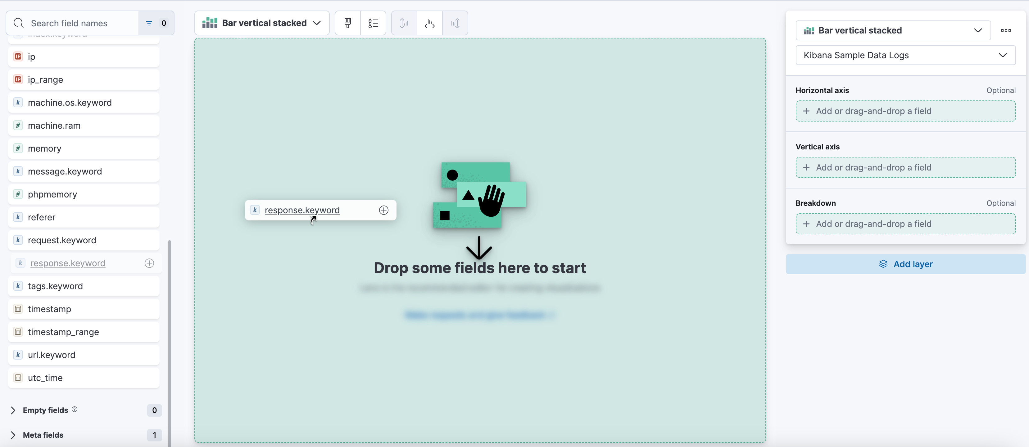
-
Drag the
geo.destfield to Breakdown in the layer pane.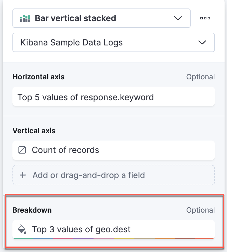
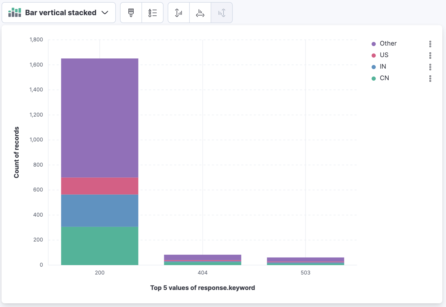
Your graph should resemble the following (the actual numbers may vary):
-
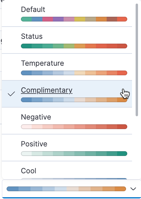
Let's adjust the appearance of the graph to create a better view. In the layer pane, click Top 3 values of geo.dest. Under Appearance, change Color palette to "Complimentary".
-
Using the dropdown, change the Visualization type to Bar vertical.

-
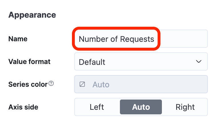
In the Layer pane, click Count of records.

This opens options for the vertical axis. There are a number of quick formulas available, but for now, we will change the Name to be Number of Requests. Close the panel.
-
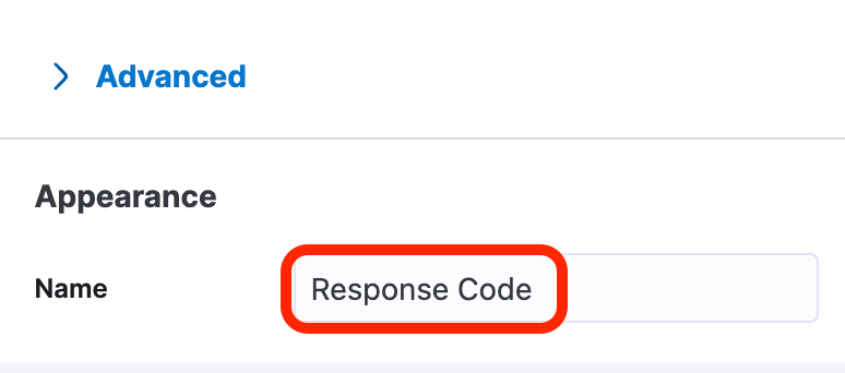
Click Top 5 values of response.keyword. In the Layer pane, change the Name to Response Code, and close the panel.
-
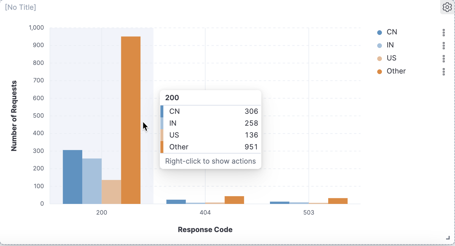
Click Save and return to return to the dashboard. Your visualization should resemble the following (the actual numbers may vary):
-
Let's create another type of visualization. Click the Create visualization button to open Lens again.
-
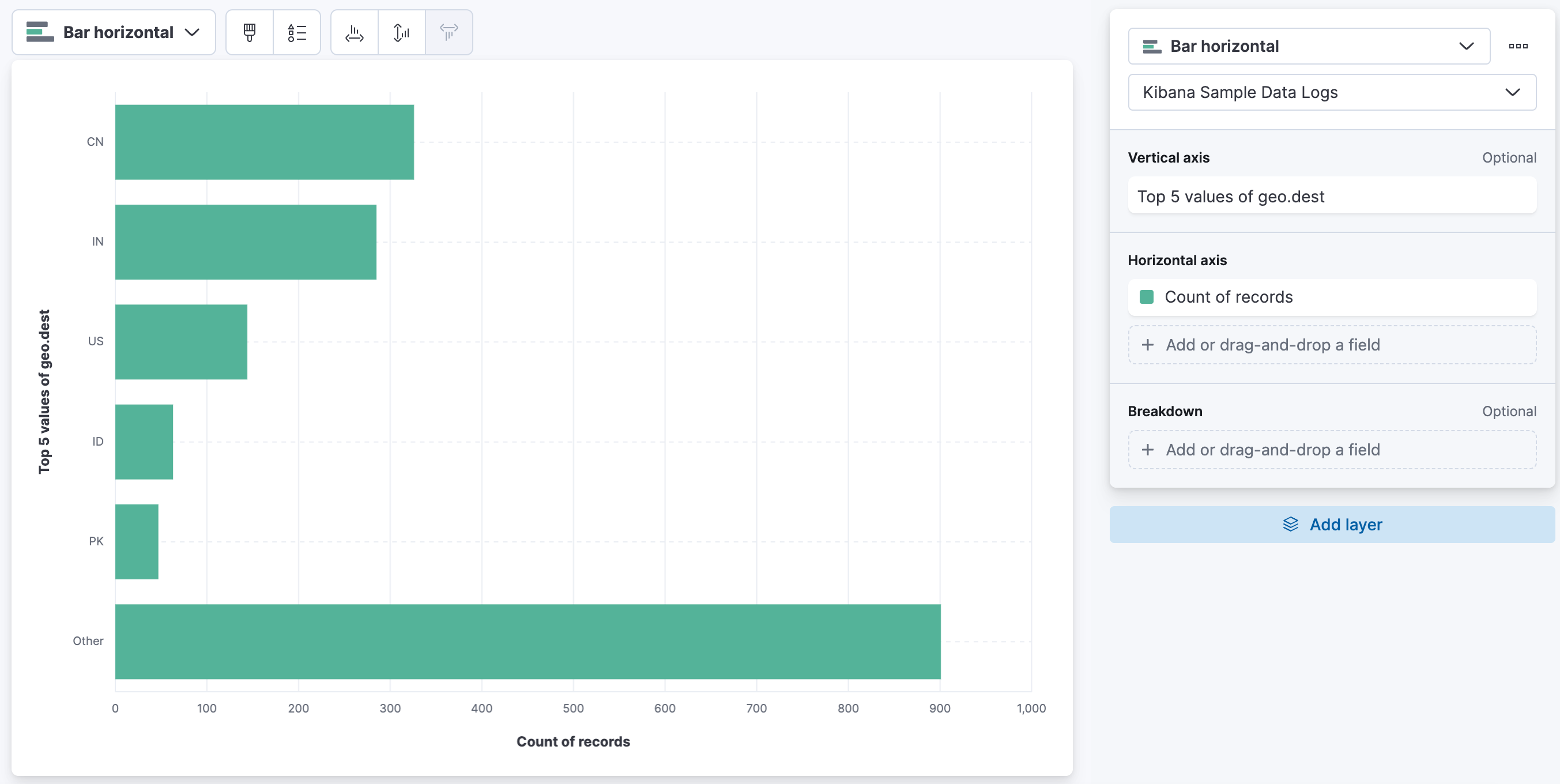
Select Bar horizontal as visualization type.
-
Drag the following fields to the Layer pane:
geo.destunder Vertical axisRecordsunder Horizontal axis
-
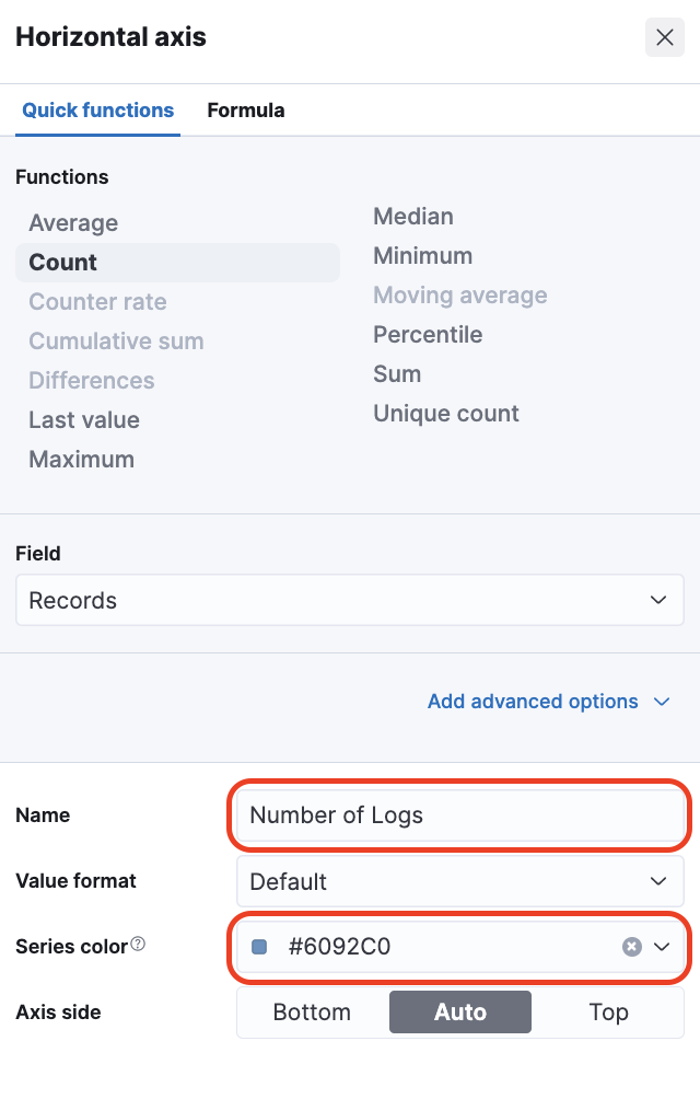
Let's improve the visualization. First, click on Count of records in the Horizontal axis section of Layer pane and set the following:
- Change Name to Number of logs
- Change Series color to
#6092C0
Click Close when done.
-
Click Top 5 values of geo.dest and set the following:
- Change Name to Destination Country
- Change Number of values to 25
- Open Advanced and disable Group remaining values as "Other"
-
Still in the Vertical Axis settings, click Add field under the Fields section and select the
machine.os.keywordfield. It will combine fields in the horizontal bar to show the amount of Logs for every Destination Country per Machine OS. Click Close when done.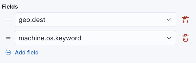
-
Your visualization should resemble the visualization below. Click Save and return return to the dashboard.

-
Let's create another visualization. Click the Create visualization button to open Lens again.
-
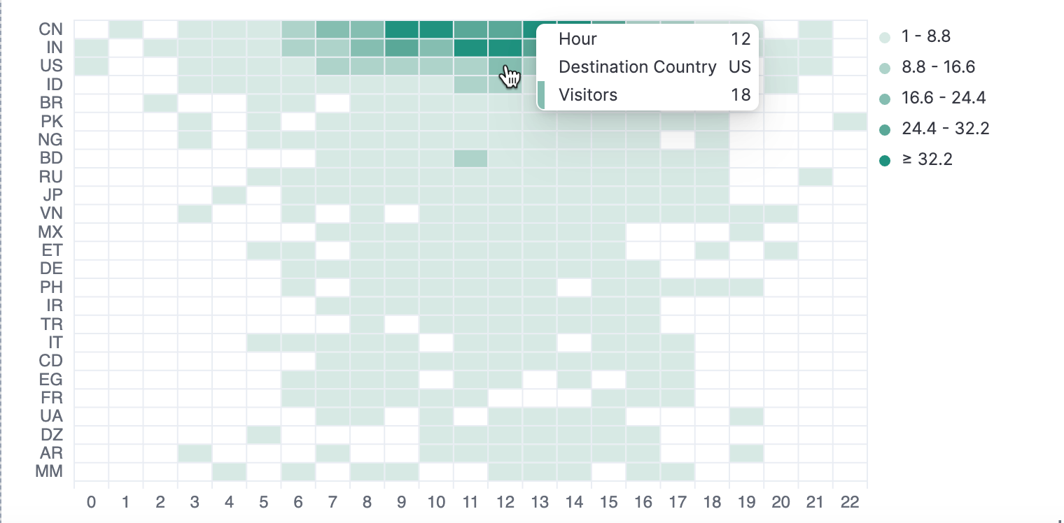
Drag three fields to the Layer pane this time:
- 'hour_of_day' to the Horizontal axis
- 'clientip' to the Vertical axis
- 'geo.dest' to Breakdown
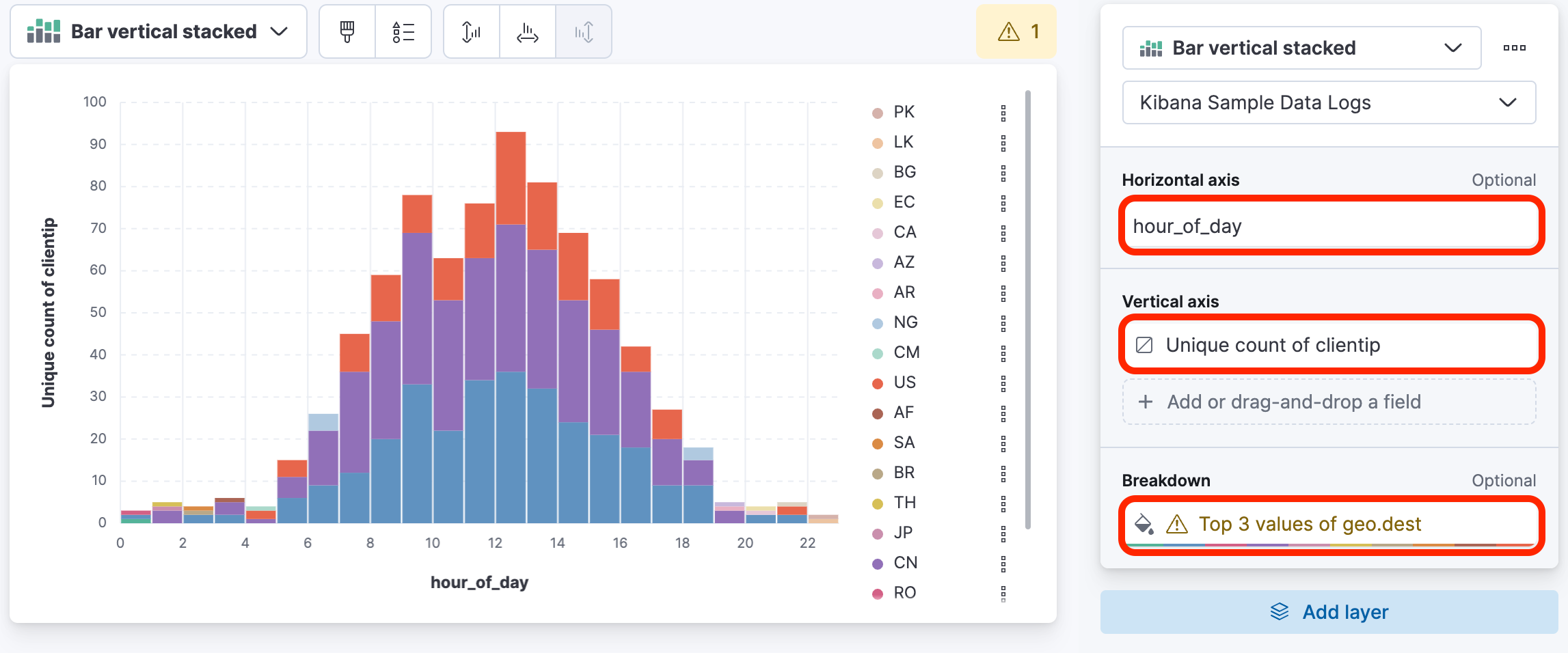 This will result in an interesting bell curve display, and the fields will have some default formulas applied.
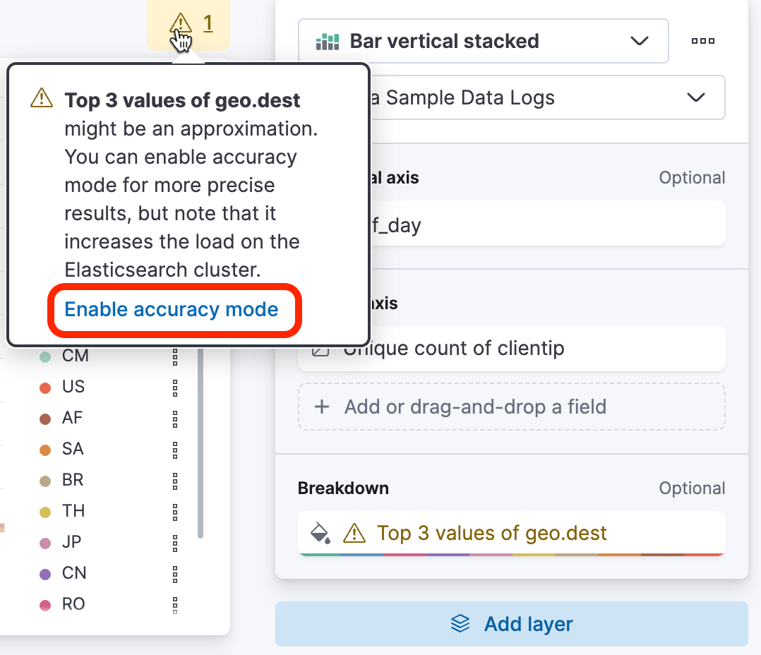
Notice the warning icon. Click the warning and enable accuracy mode at the bottom.
-
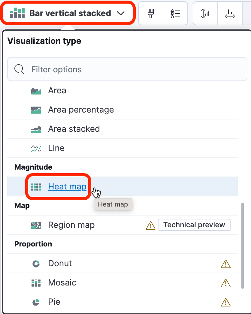
Change the type of the graph to a Heatmap using the dropdown.
-
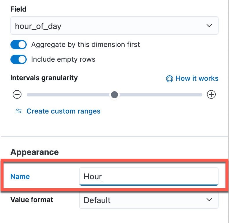
Let's change some settings to improve the view. First, click hour_of_day under Horizonal axis so that the Display name is simply Hour. Close the panel.
-
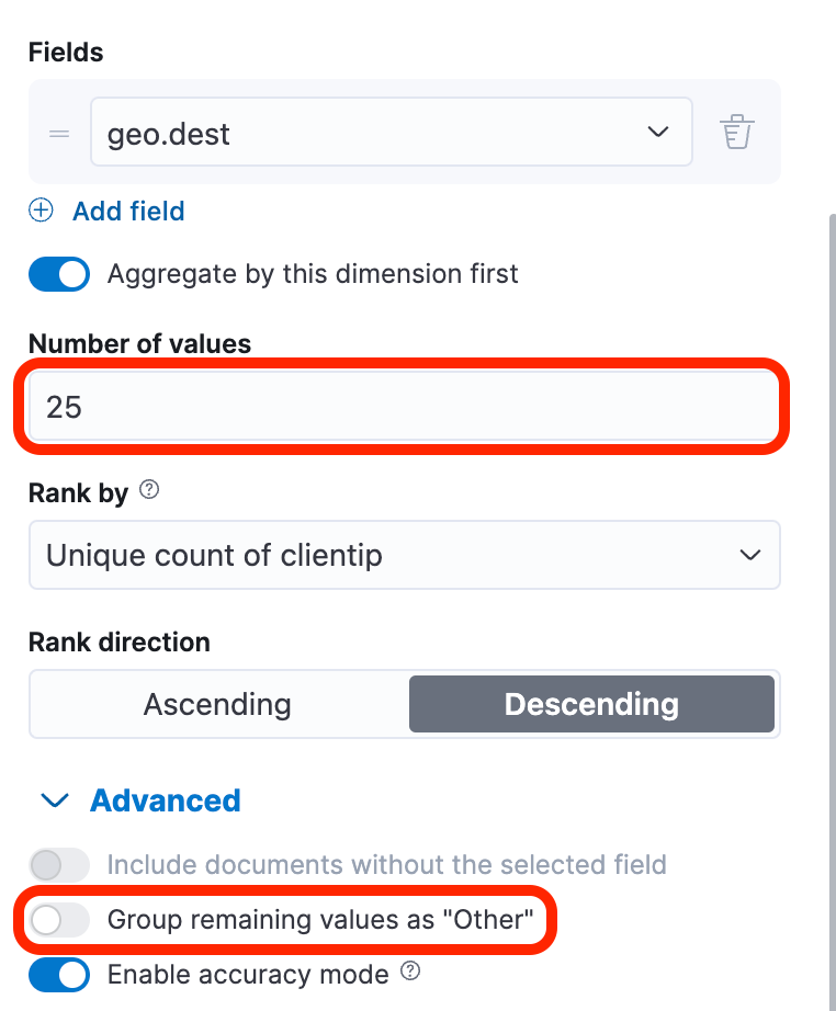
Next, click Top 3 values of geo.dest.
- Change the Name to Destination Country
- Increase the Number of values to 25.
- Enable Aggregate by this dimension first.
- Open Advanced and disable Group remaining values as Other
-
Click Unique count of clientip under "Cell value". Change the following:
- color palette to Positive
- name to Visitors

-
Save and return to your dashboard, and then Save your dashboard.
-
Click Switch to view mode and then hover over one of the cells in your Heatmap to see the labels.
Summary:
In this lab, you added few more visualizations to your dashboard and customized the display of data.