2.3: Field Focus
Objective:
In this lab, you will create visualizations of the web logs sample data and add them to your dashboard.
-
In Kibana, open the Discover interface by clicking on:
- > Analytics > Discover
-
Set your context to use the Kibana Sample Data Logs data view for the last 7 days. If your Discover interface still contains filters and queries from the previous lab, make sure to click on the New button to clear the view:

Your view should look like this:
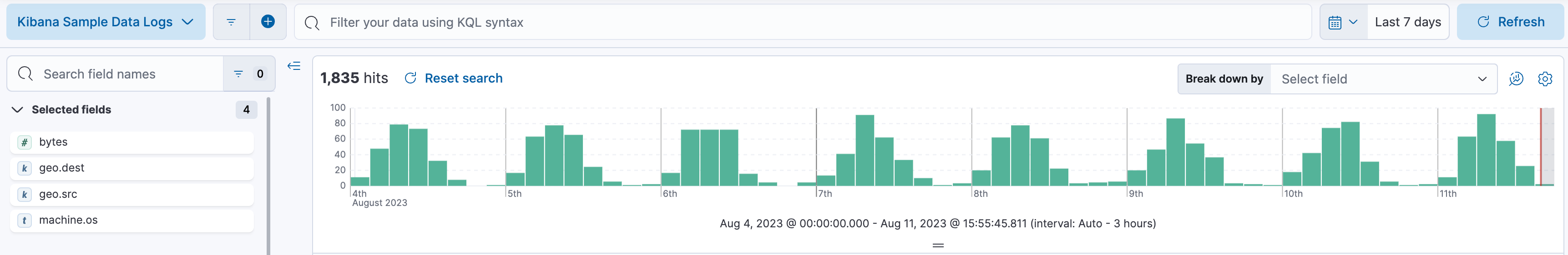
Note: you may already have this view from the previous lab. If you view does not load, you may need to refresh the page.
-
Let's focus in on a single field. In the Fields List, search for
geo.destand then click on the field and click Visualize.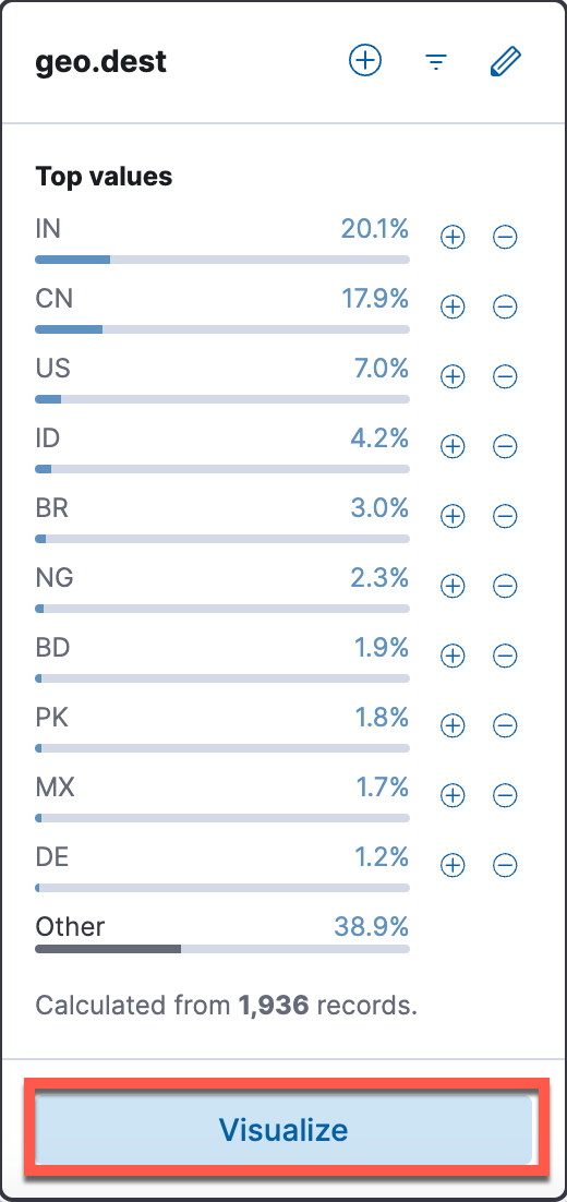
-
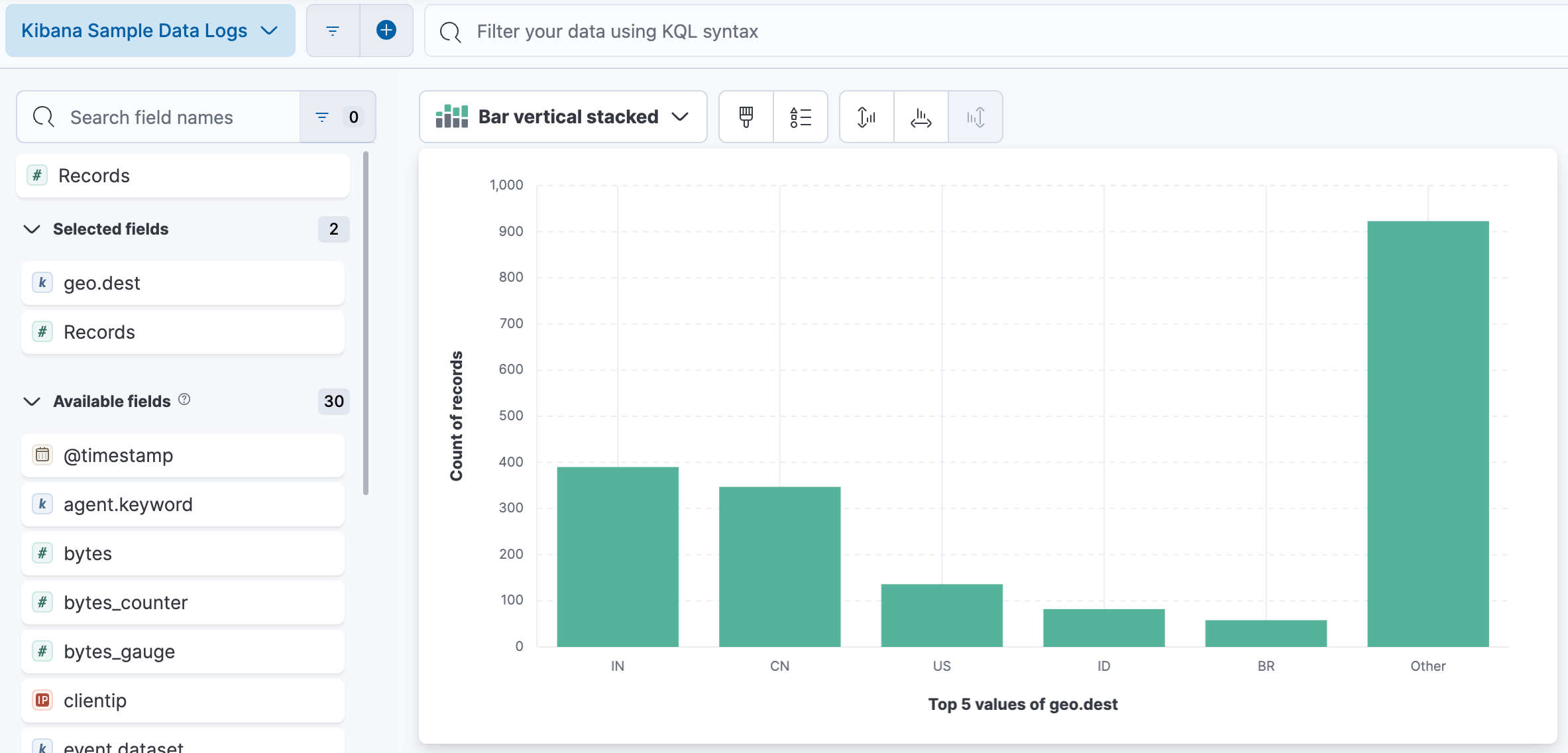
This opens a simple Lens visualization of the top 5 destination countries.
-
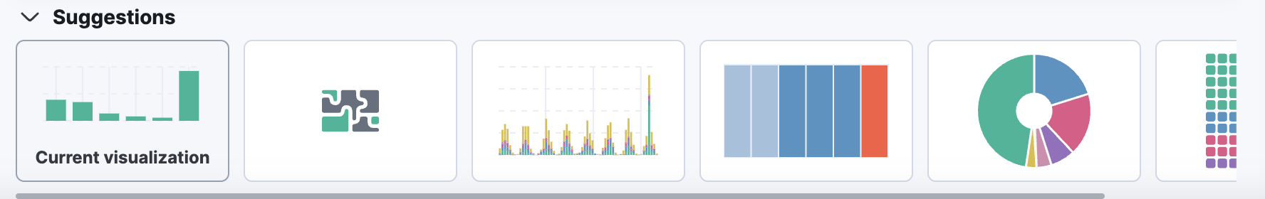
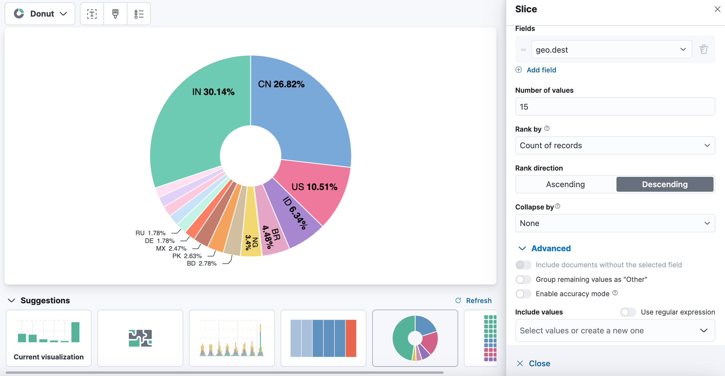
This view is a little dull. In the Suggestions area, select the Donut visualization type. (This step can also be done with the Visualization type dropdown.)
-
Expand the top 5 to the top 15, and get rid of the Other slice.
Show answer
In the Layer Pane, click Top 5 values of geo.dest to edit the field. Increase the Number of values to 15. Expand Advanced and de-select Group other values as "Other". Your donut should be much more colorful now.
-
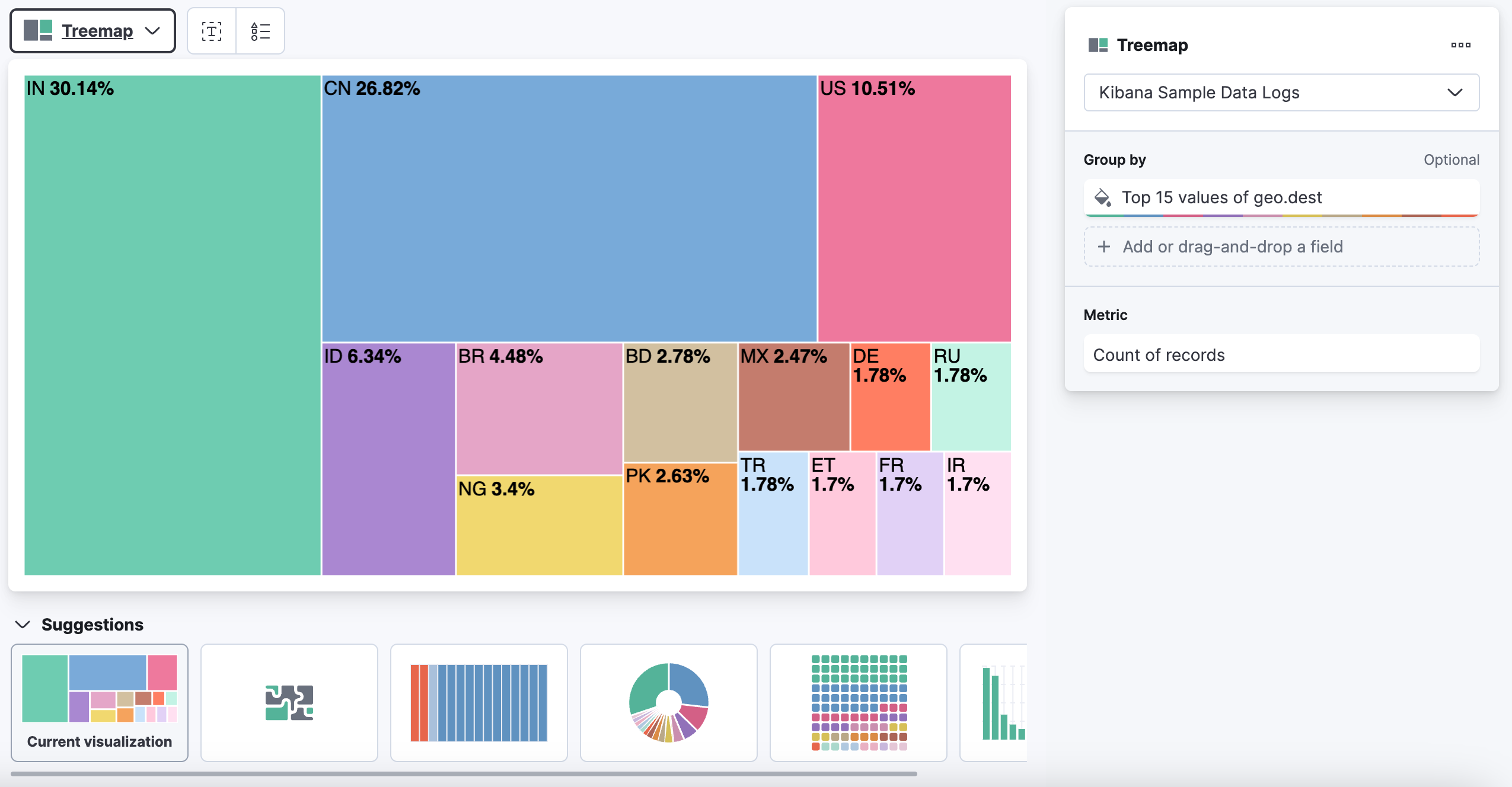
Let's change our view one more time to a Treemap. This will appear as a panel of colorful boxes in the Suggestions area, or if not available there, can be found from the Visualization types dropdown. Changing to the treemap keeps all the settings for the number of values.
-
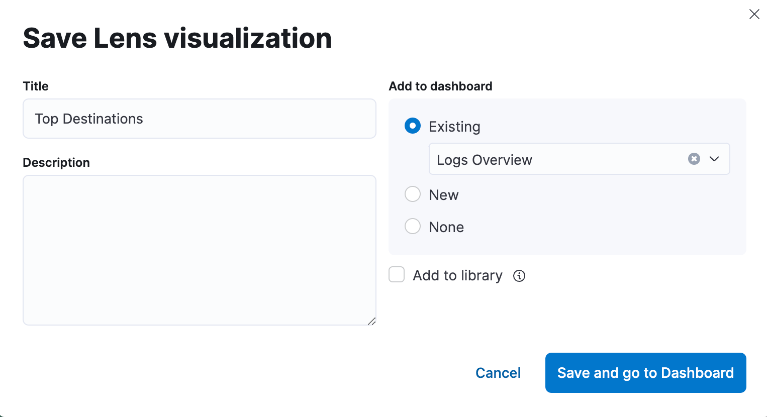
There is a lot more that can be done with Lens. We'll see more of that in future modules. For now, let's save this visualization. Click Save in the upper right hand corner. Name your visualization Top Destinations, select Existing under Add to dashboard and add to your Logs Overview, then click Save and go to Dashboard.
-
Click Save to save your Dashboard.
-
Navigate back to Discover.
-
In the field list search for the field named
geo.coordinates, click on the field name and then click the Visualize button.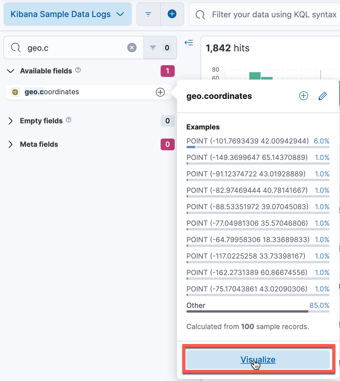
-
As the field is of type geo point, the previous action will open the field with the Maps visualization tool, instead of Lens.
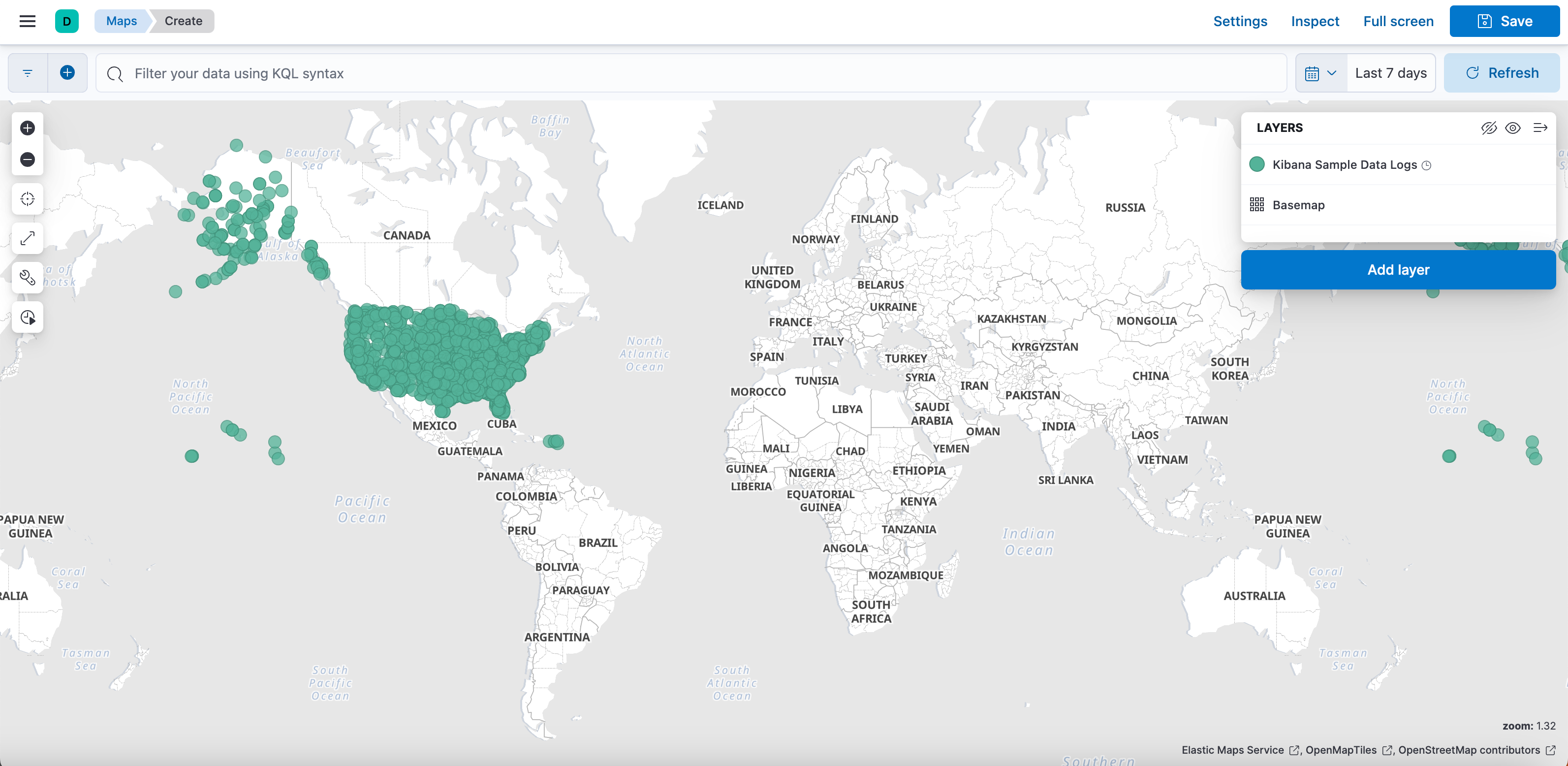
-
The Maps tool will be investigated in more detail in the next module. For now, save the visualization to your Logs Overview dashboard with the Save dialog. Name the visualization Simple Logs Map, and click Save and go to Dashboard.
-
Your Logs Overview dashboard now opens with all of your visualizations available. Be sure to Save the dashboard!
-
Hover on the Treemap visualization with your mouse, a tooltip will appear. Click one of the sections of the treemap to create a filter on the fly. The filter will be applied to all visualizations in the dashboard.

-
Load your saved query CN-404 Query in your dashboard. This replaces the filter you created from the treemap.
Summary:
In this lab, you created new Maps and Lens visualizations of the web logs data and added them to your dashboard. You also created a filter from a visualization and loaded a saved query.