3.2: Adjust Visualizations
Objective:
In this lab, you will adjust the look of some of the visualizations we already have in the Logs Overview dashboard. You will also add annotations and reference lines to visualizations.
-
Open the Logs Overview dashboard.
- Make sure to view the Last 7 days of data.
- Click the Edit button. Note: If the dashboard is already in Edit mode, you'll see a Save button instead.
-
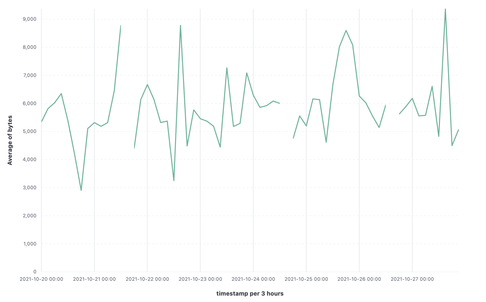
Create a new visualization that displays the average bytes over time as a line graph. The visualization should resemble the image below.
Show answer
From the Dashboard, click Create visualization.
Drag the bytes field to the workspace.
Change the Median of bytes to Average of bytes.
Change the visualization type to Line.
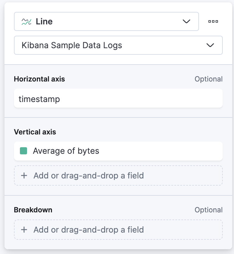
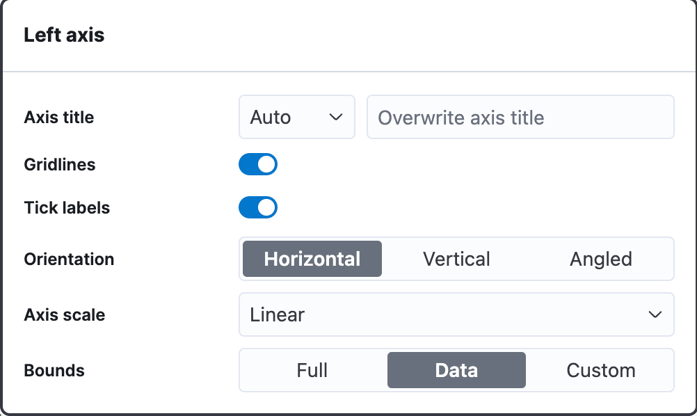
The Vertical Axis configuration should resemble the image below:
-
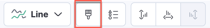
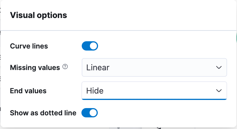
The data may have gaps. Update the visualization so that lines are curved and dotted, and fill in gaps linearly.
Show answer
Under visual options enable Curve lines and for Missing values select Linear.
Keep Show as dotted line enabled.
-
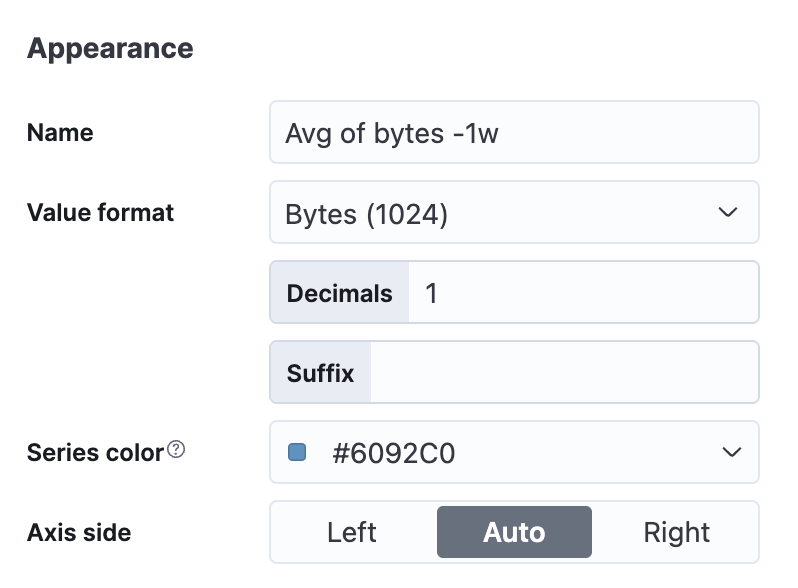
Add a new layer with the same settings as above, except with a time shift of one week. Use
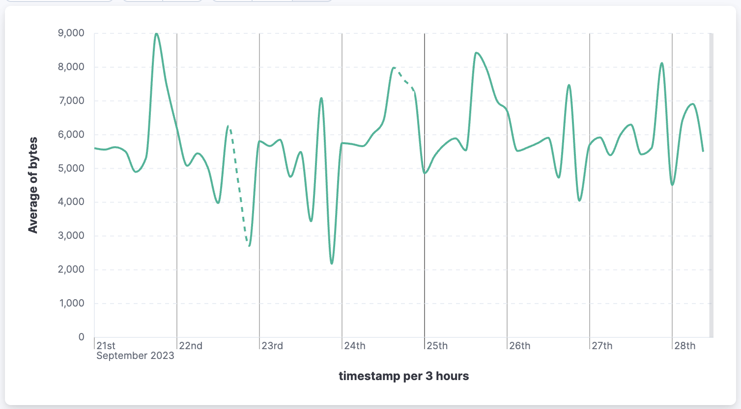
#6092C0for the color. Label the graph "Avg bytes -1w". The visualization should resemble the image below.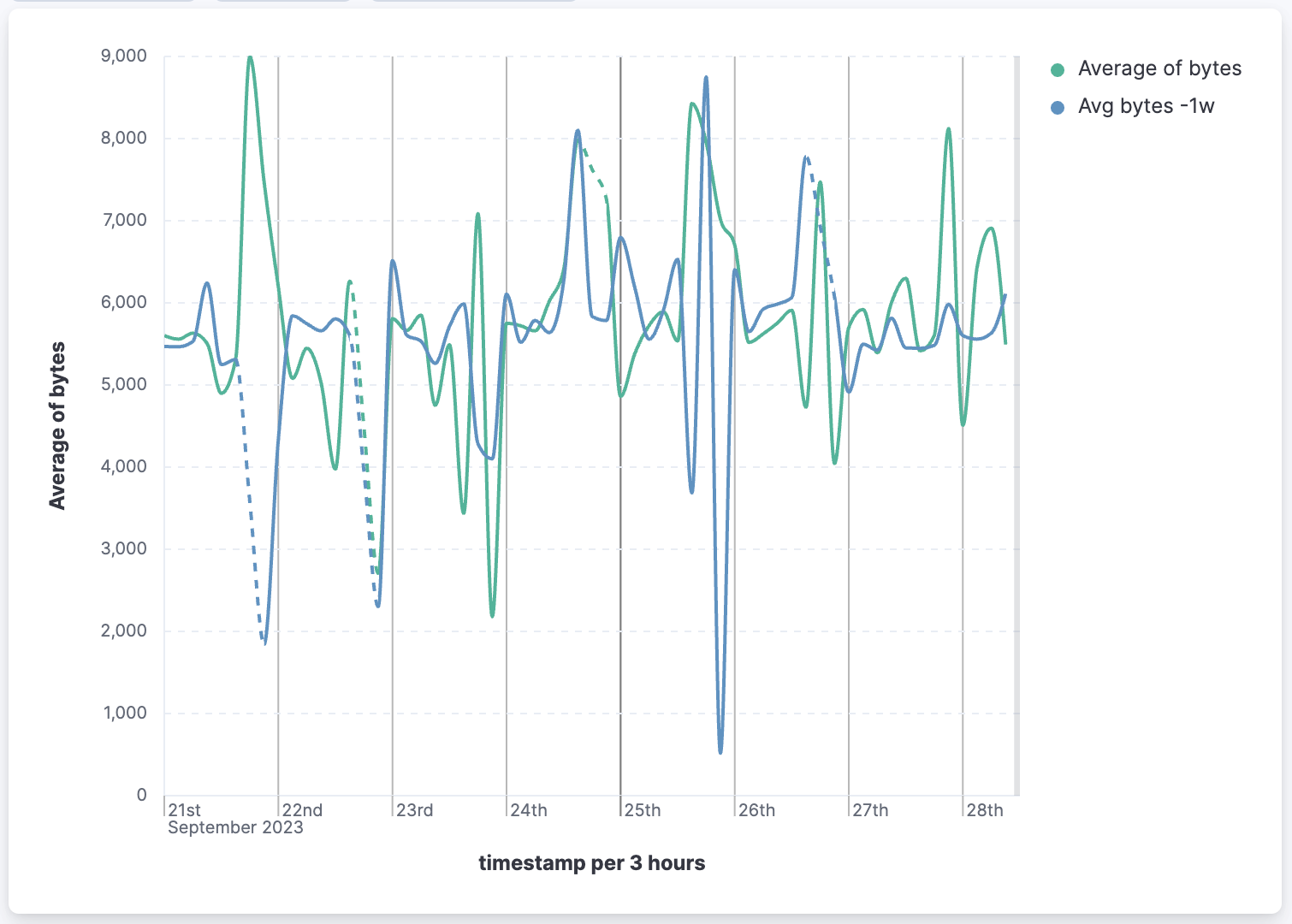
Show answer
Click Add layer and select Visualization (or you could use Duplicate layer from the original layer).
Set the Horizontal axis to timestamp and the Vertical axis to bytes.
Change the visualization type to Line.
-
Change the Median of bytes to Average of bytes.
-
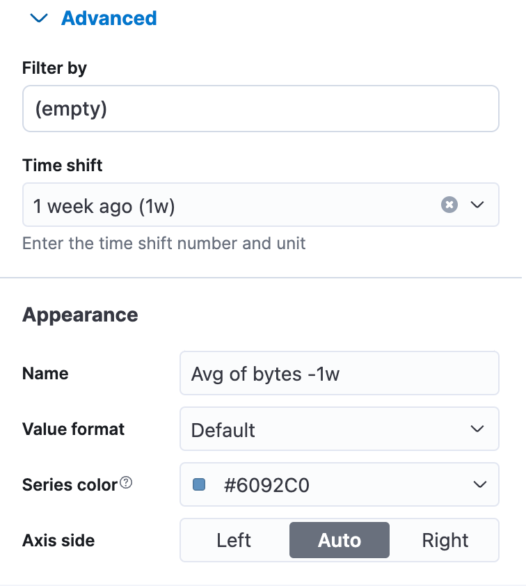
Open Advanced and select Select 1 week ago (1w) for the Time shift.
-
Change the Display name to "Avg bytes -1w".
-
Make sure the series color differs from the first layer.
Under visual options enable Curve lines and for Missing values select Linear.
The Vertical Axis configuration should resemble the following:
-
-
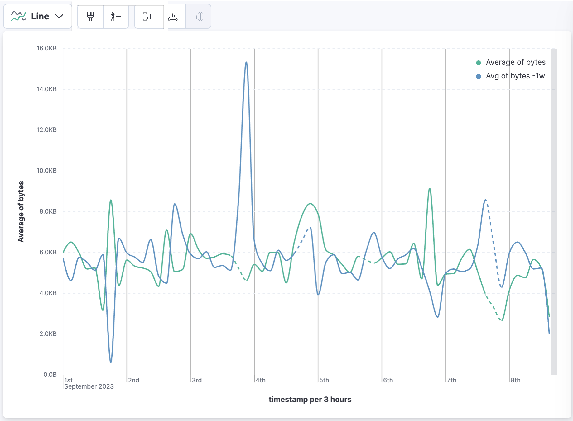
Change the display for both layers:
- Display the value format as bytes with one decimal place.
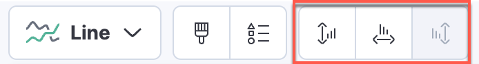
- Using the buttons above the workspace, change the axis bounds to data bounds.
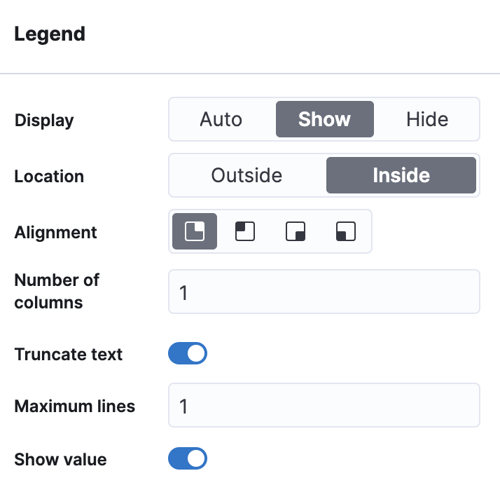
- Move the legend inside and show values.
Show answer
In the Layer pane, click on Average of bytes.
Change the Value format to Bytes and Decimal to 1.
Do the same for Avg bytes -1w.
Change the axis option to display data bounds. Note: Data bounds is only available for Line charts.
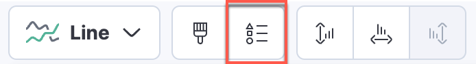
Under legend options set the following: Display to Show, Location to Inside, and enable Show value.
-
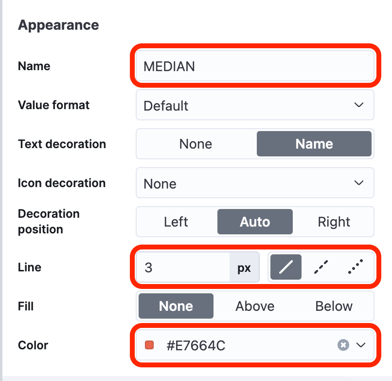
Create a new layer that has a reference line that represents the "median of bytes". Display the name of "MEDIAN" for the reference line with a width of 3 px and the color
#E7664C.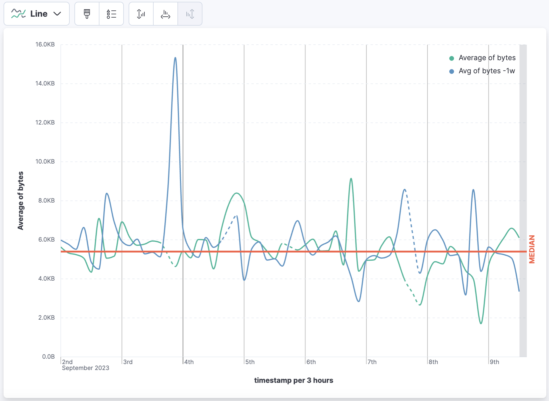
Show answer
Click Add layer and select Reference lines.
Delete the static value that is displayed on the Vertical left axis.
Drag the field "bytes" into the Vertical left axis and then click Median of bytes to change the settings.
-
Click Save and return to return to the dashboard.
-
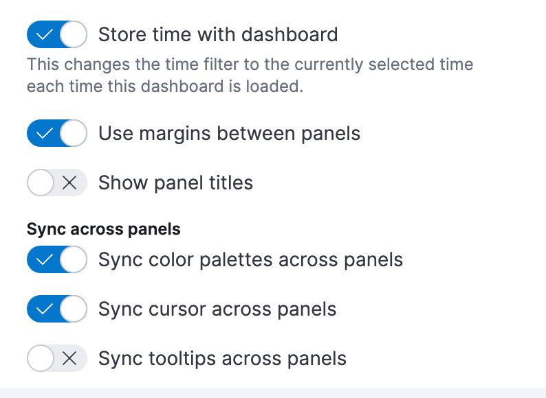
Open the dashboard Settings. Disable Show panel titles and enable Sync color palettes across panels. Apply the dashboard settings.
-
Next, we want to continue to analyze the bytes data using another chart. Clone the visualization you just created by clicking the gear icon and selecting Clone panel.
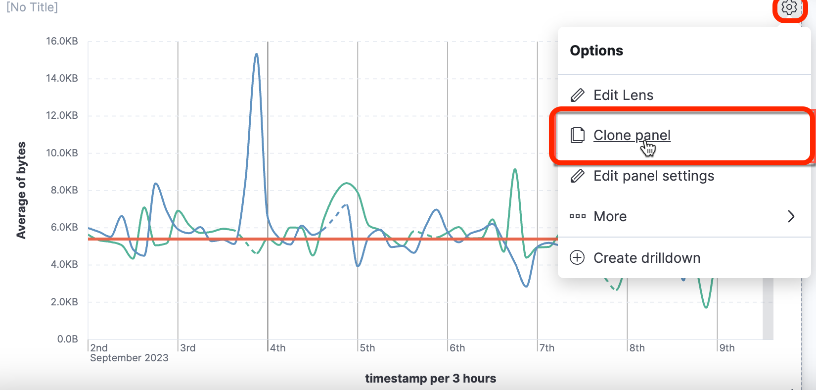
-
Click the gear icon again and select Edit Lens to return to Lens.
-
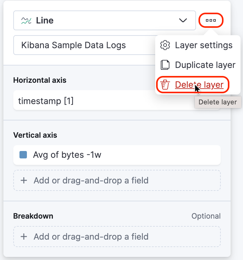
First, let's remove the line chart layer that displays "Avg of byes -1w" from the graph. Click the three dots in the top right of the layer and select Delete layer.
-
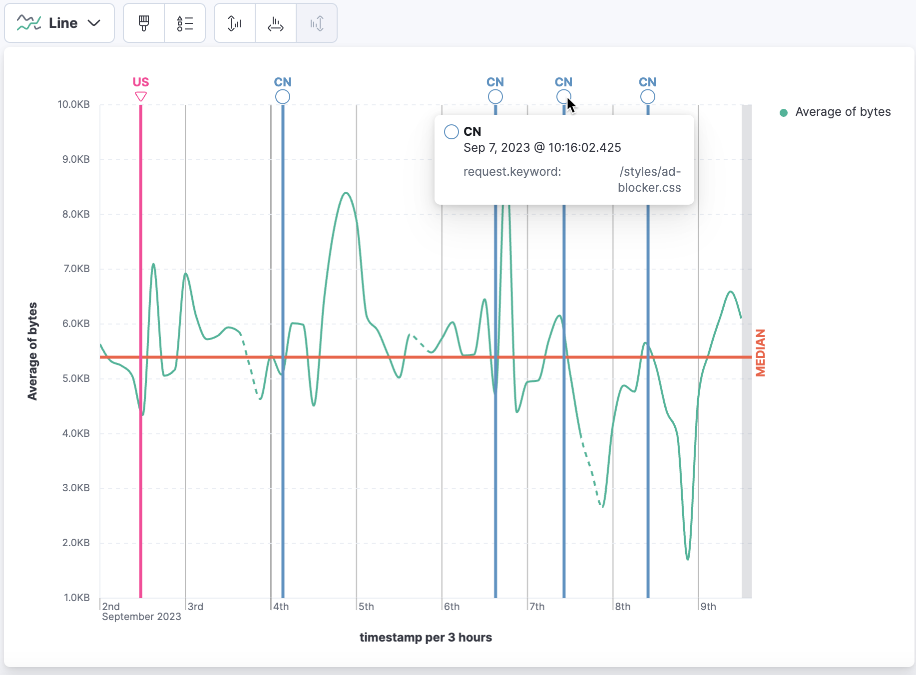
Now, let's add a layer containing annotations that identify when there is a response of "503" (service unavailable) from US and CN destinations, each with a line 3px in width.
- The US annotation is identified by an inverted triangle with the text "US." and line color
#F04E98 - The CN annotation is identified by a circle with the text "CN" and and line color
#6092C0 - A tooltip displays the timestamp (by default) and the value of
request.keyword - The legend "Average of bytes" is displayed on the outside of the graph
Show answer
Click on Add layer and select Annotations.
-
Click on the Horizontal axis and modify the settings as follows, using this query:
or
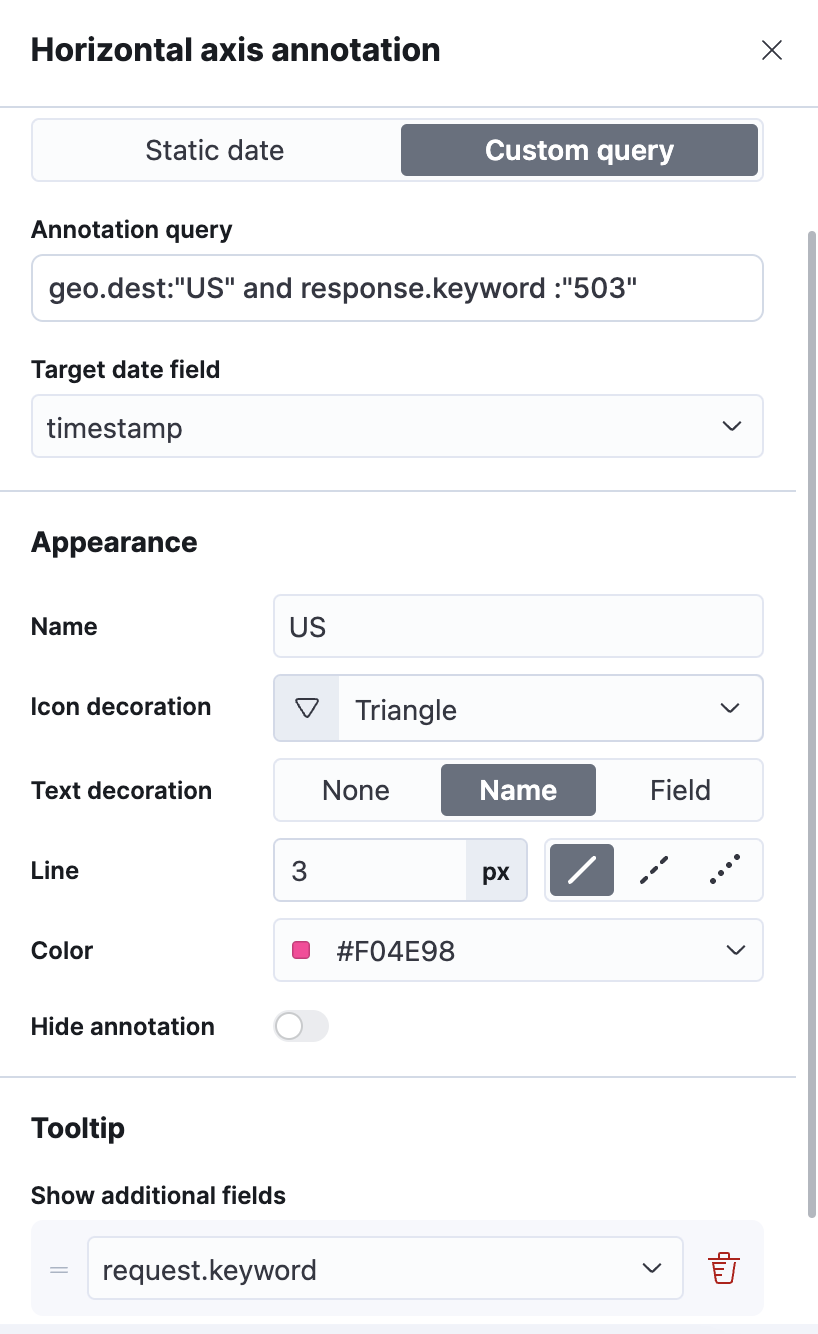
For CN, click Add an annotation and follow the similar steps for
CN.Note that the Custom query needs to use CN instead of US:
geo.dest:"CN" and response.keyword:"503".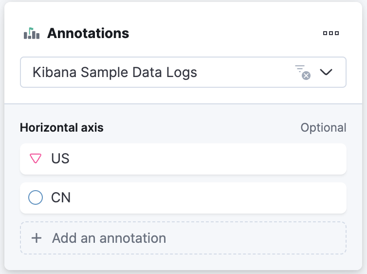
Alternatively, you can duplicate the US annotation layer and replace
USwithCN. This will give you two separate annotation layers.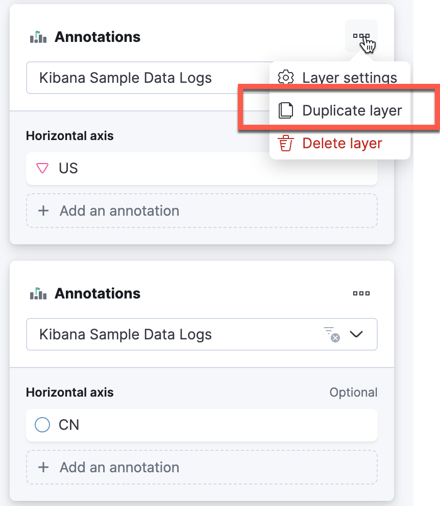
Be sure to update the following in the new annotation layer:
- geo.dest to
CNin the Annotation query - Name to
CN - Icon decoration to Circle
- Text decoration to Name
- Line to 3px
- Color to
#6092C0 - Tooltip field to
request.keyword
- The US annotation is identified by an inverted triangle with the text "US." and line color
-
Click Save and return to return to the dashboard. Lastly, Save your dashboard.
Summary:
In this lab, you learned how to create a line chart with a time shift, curve lines, and adjust axis bounds. You also added reference lines and annotations to visualizations.