2: Asking questions
Objective:
In this lab, you will start asking and answering some questions by adding more visualizations.
-
Notice that the blog
/blog/welcome-insight-io-to-the-elastic-teamhad significantly more requests than other blogs.
Let's learn more about what's happening there. First click on
/blog/welcome-insight-io-to-the-elastic-teamin the horizontal bar chart in the dashboard Elastic logs.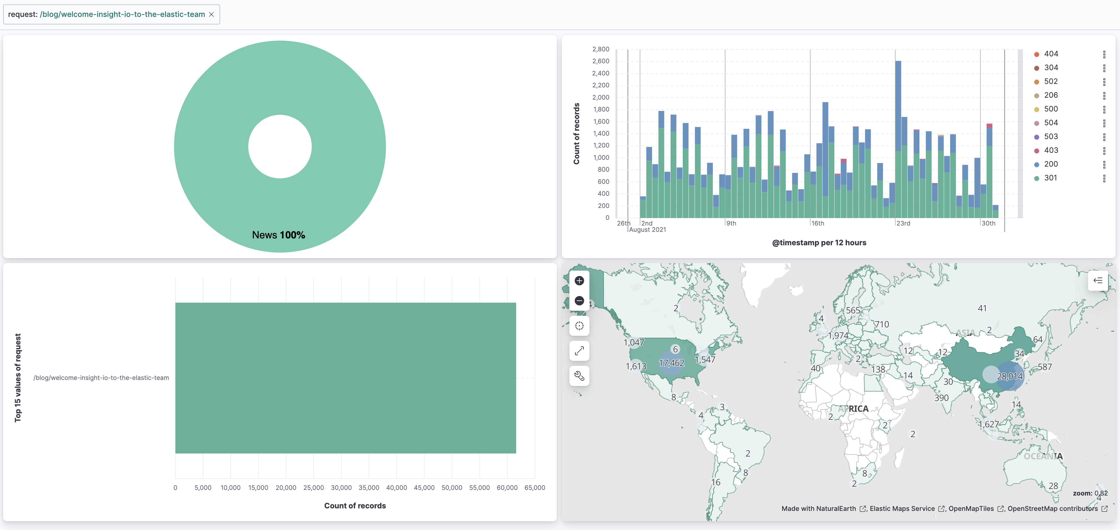
This creates a filter for the blog. Now the dashboard has changed to show only the graphs for the documents of visitors to that one blog page. We're able to learn some things about the visitors to that blog page, but not too much. We can see where the visitors are concentrated on the map – US and China - and which status codes are commonly seen – 301 and 200.
The other charts offer little extra information. Since we're looking at one blog, the donut chart of categories is really just showing us that the blog
/blog/welcome-insight-io-to-the-elastic-teamis in the category "News". -
Let's create a new dashboard, one that will give us more detailed information about visitors to a specific blog. Let's add some of the visualizations from the Elastic logs dashboard into the new dashboard. Add the date histogram and maps visualizations to a new dashboard called Blog details. The new dashboard should look like the image below.

Show answer
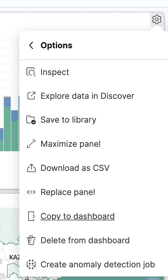
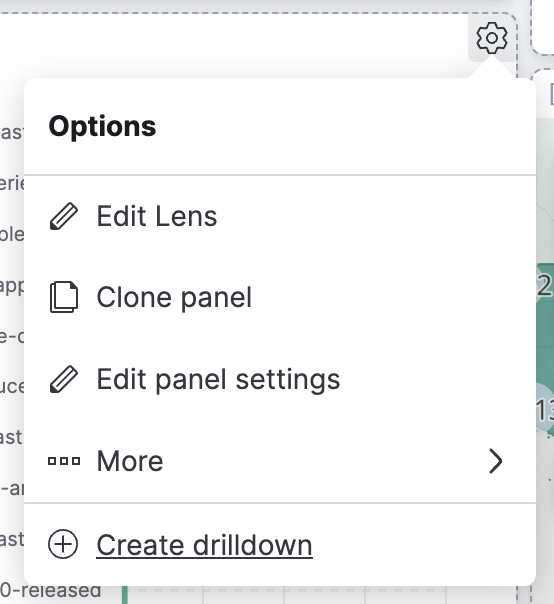
Click on the visualization options (gear symbol on the top-right corner) of the date histogram. Select More and Copy to dashboard.
Select New dashboard.
Save the dashboard as Blog details.Go back to the Elastic logs dashboard from the main menu's Recently Viewed. Copy over the map to Blog details. This time instead of New dashboard, copy the map to an existing dashboard Blog details.

-
Modify the date histogram. Add a new layer – a line chart displaying the average bytes to the Blog details dashboard. Use the field
bytes_sent. The graph should look like the image below.
Show answer
Go to the visualization options and select Edit Lens.
In the layer pane, select Add a layer.
Click Visualization and select the Line chart for the Layer visualization type.
Select the field@timestampfor the Horizontal axis. (You can drag and drop or click and add.)
Select Averagebytes_sentfor the Vertical axis.
Set the Value format to Bytes (1024) and change the Axis side to Right.
You may change the color to something more noticable if you'd like.
-
Add a horizontal bar chart of the top 10 user agents to the Blog details dashboard. Use the field
useragent. The graph should look like the image below.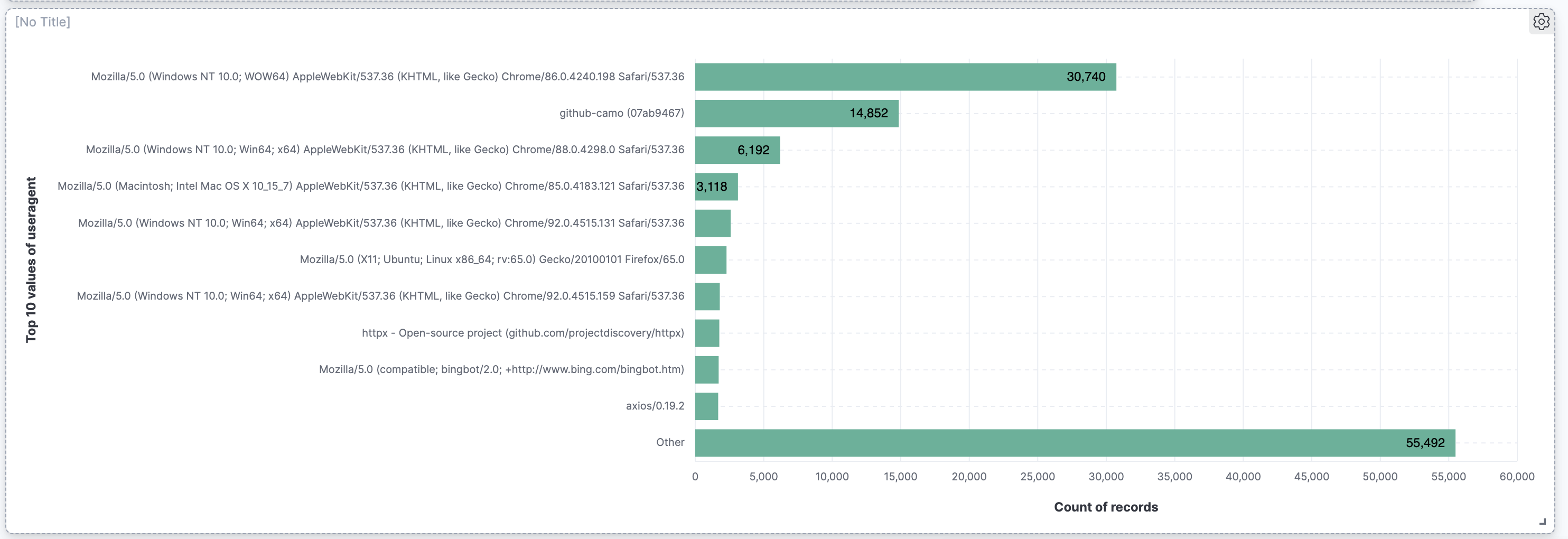
Show answer
Click Create visualization to go to Lens. Drag and drop the
useragentfield into the workspace. Select Bar horizontal from the Visualization type drop down menu.Click on Top values of useragent and change the Number of values to 10.

Go to Visual options and select Show for Labels.
Save and Return to your dashboard. Save your dashboard.
-
Add a document table with the fields
geoip.country_name,useragent,bytes_sent, and any other fields you find interesting to the Blog details dashboard.
Your dashboard should look like the image below.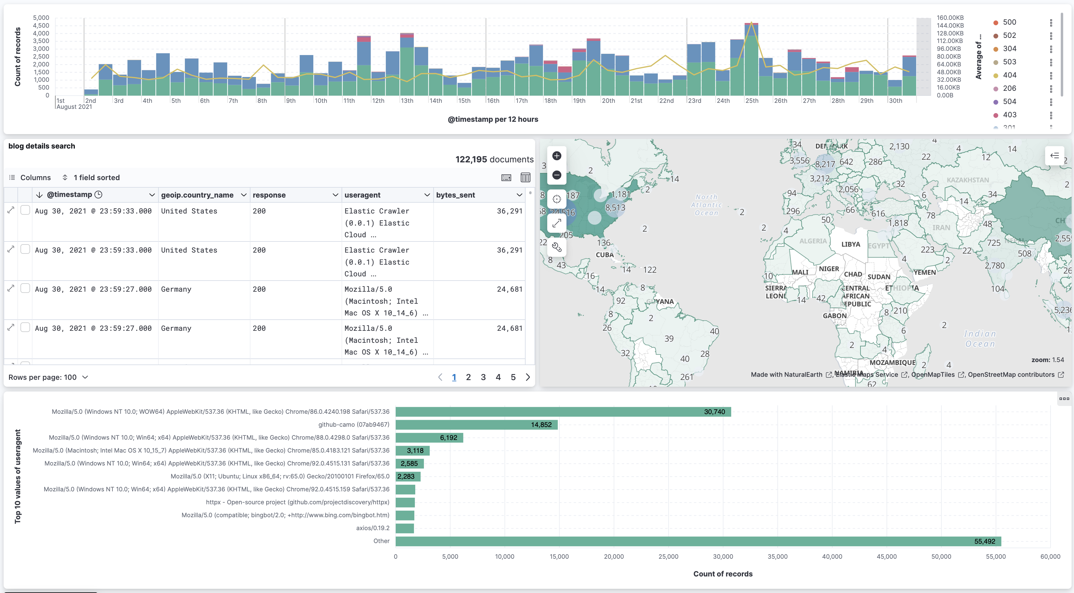
Show answer
Go to Discover. Select the fields from the fields list.

Save the search as
blog details search.
Go to the Blog details dashboard. Click Add from library. Select
blog details search.
Save your dashboard.
-
Go back to the Elastic Log dashboard.
Create two drilldowns from the horizontal bar chart of top requests :- One to the Blog details dashboard with filters applied.
- One to go directly to the blog page URL.

Show answer
Go to the Elastic Log dashboard. Click on the visualization options menu for the horizontal bar chart and select Create drilldown.
Select Go to Dashboard.
Change the Name to Go to Blog details and select Blog details for the destination dashboard. Keep the filter and date range options enabled and save it.
Go back to Create drilldown, this time select Go to URL.
Change the Name to Go to blog page.
Select the Single click Trigger. Under Enter URL enterhttps://elastic.co{{event.value}}.
Save your dashboard.
-
Click on the drilldown for the requst
/blog/welcome-insight-io-to-the-elastic-team. -
What is causing those 301 errors for visitors of
/blog/welcome-insight-io-to-the-elastic-team?Show answer
Click on the date histogram where there is a 301 error and select only the filer
response:301.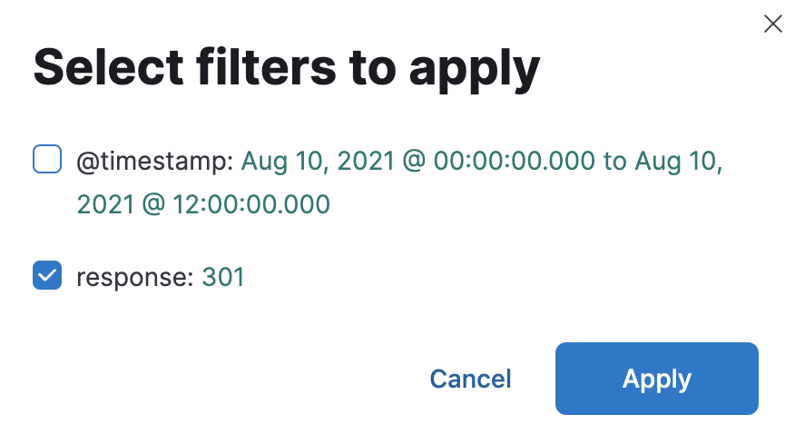
The map doesn't really help. The requests that encountered a 301 error seems to be coming from all over the world. However, the user agent has an unusually high number of
Mozilla/5.0 (Windows NT 10.0; WOW64) AppleWebKit/537.36 (KHTML, like Gecko) Chrome/86.0.4240.198 Safari/537.36. Click on that user agent to create a filter for it.
The map again shows that there are many users using Mozilla on Windows NT all over the world who have encountered a 301 error.

Try clicking on any country to create a filter for that country (click the iso-code-2 in the tooltip).

Remove that filter and try another country. Keep doing this. You might notice that the user activity in the date histogram suggests that there are sudden bursts of activity. Here's one for India:

Here's Sweden:

Perhaps what happened is that users who tried to visit
/blog/welcome-insight-io-to-the-elastic-teamencountered a 301 error so they kept refreshing their page to no avail. This might be a good time to contact your webteam to let them know that this page is not loading correctly for certain browsers, specificallyMozilla/5.0 (Windows NT 10.0; WOW64) AppleWebKit/537.36 (KHTML, like Gecko) Chrome/86.0.4240.198 Safari/537.36. Rename the filter Windows NT and pin it.Now remove those country filters and exclude the Windows NT filter.
There's an unusually high number of user agents for
github-camo. Select it to create a filter for it.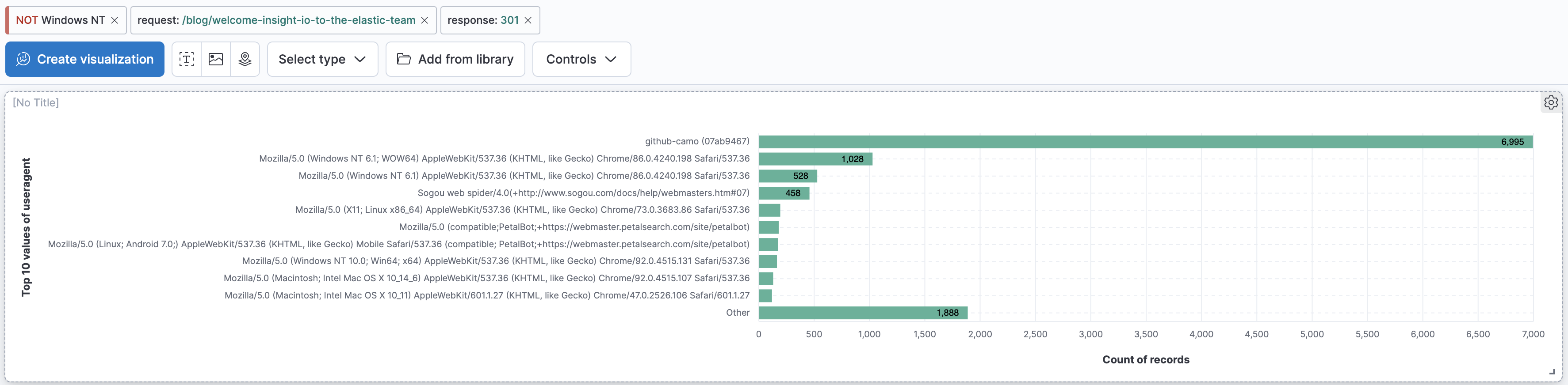
Notice that the requests with this user agent is isolated to one location!
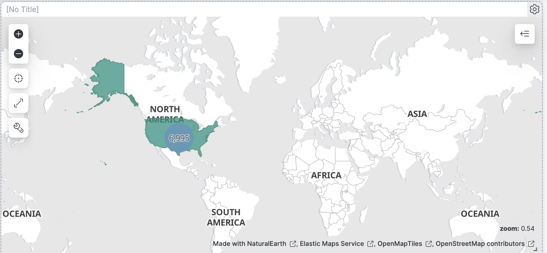
If you keep zooming into the clustered point (where you see the number 7029) you'll see it's some place near Wichita, Kansas in the US.

This is strange! This user agent accesses this page many times thorughout the month.

Disable the "response:301" filter. You'll notice it accesses this page many more times, all throughout the month – not always getting a 301 error.

Now disable the
request:/blog/welcome-insight-io-to-the-elastic-teamfilter. Nothing's changed! That means that this user agent only ever accesses this particular page, and many, many times. What's going on? This might be a good time to talk to your cyber security team. Rename the filter github-camo and pin it. -
Remove all filters on the Blog details dashboard except for the
request:/blog/welcome-insight-io-to-the-elastic-teamfilter.
Notice there are two spikes in the date histogram when there is higher than usual activity and also less than usual average bytes. That seems counter intuitive. What's going on?
Show answer
Let's first zoom into the taller spike. Click and drag on the date histogram near the tall bar to zoom into a tighter time range around the anomalous acitivity.

There it is again, that strange huge spike in the graph. It looks like it consists of only 200 responses. Let's click on that tall bar. It asks which filter we want to use.
Let's use the time filter for that 30 min interval with the 1300 requests.

Check out the other visualizations to see if you find anything strange.
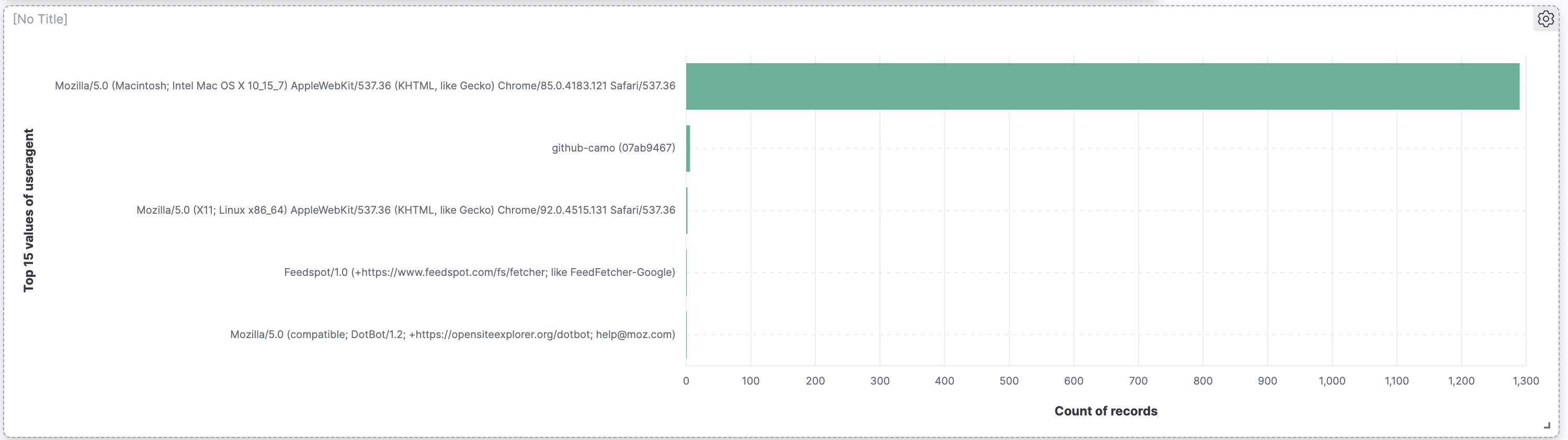
Most of the 1300 visits in that 30 minute interval were from the user agent "Mozilla/5.0 (Macintosh; Intel Mac OS X 10_15_7) AppleWebKit/537.36 (KHTML, like Gecko) Chrome/85.0.4183.121 Safari/537.36". Let's create a filter for it.
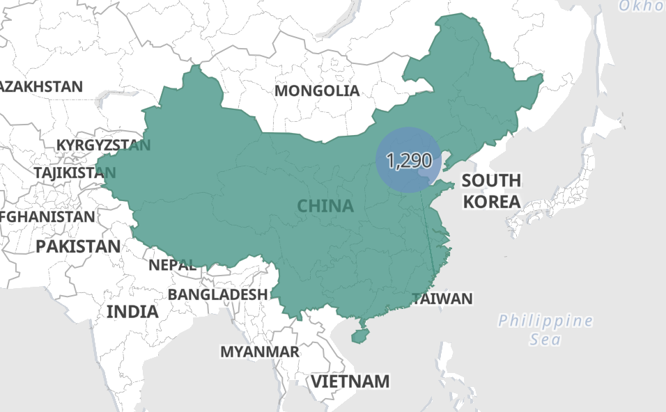
Wow it looks like there's one location for this useragent! Specifically in Beijing, China.
Let's zoom back out to all of August with the useragent filter still enabled.
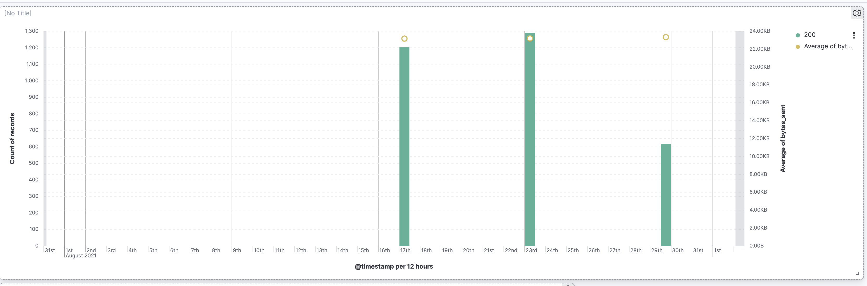
That's is quite telling! It looks like the first two bumps coincide with the anomaly were are investigating. What happens if we exclude this user agent?

No more spikes! Let's inform our cyber security team! Rename the filter OSX Beijing and pin it.
Summary:
In this lab, you created a second dashboard you can use with Drilldown to get more details about a specific blog you want to investigate. We also asked a few questions and found ways to answer them.