4.1: Text and Metrics
Objective:
In this lab, you will add Text panels to your dashboards as well as add metric visualizations using Lens.
-
Open the Logs Overview dashboard.
- Make sure to view the Last 7 days of data.
- Click the Edit button. Note: If the dashboard is already in Edit mode, you'll see a Save button instead.
-
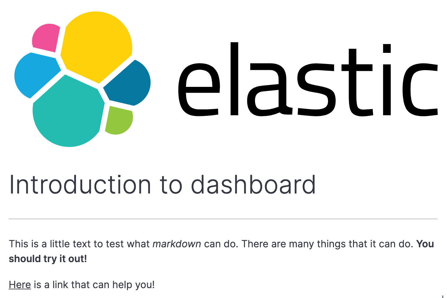
Edit the Text visualization you created in lab 1.2. Replace it so that it resembles the image below.
- Use the following link to add this logo image.
- The following link refers to the Markdown documentation. Be sure to use the "Inline-style" syntax, and display 'Elastic Logo' as the title text.
Show answer
In the top right corner of the text visualization, click the settings icon.
Click Edit visualization.
Enter the following text in the Markdown area:
 # Introduction to the dashboard --- This is a little text to test what *markdown* can do. There are many things that it can do. **You should try it out!** [Here](https://github.com/adam-p/markdown-here/wiki/Markdown-Cheatsheet) is a link that can help you!Click Update
Click Save and return.
On the dashboard, resize the visualization if needed so the changes are visible.
-
Create another Text visualization that adds a footer to the bottom, center of the dashboard. It should look as follows:

- You can find the logo here: Footer logo image. Be sure to use the "Inline-style" syntax, and display 'Elastic Logo' as the title text.
- In the Options tab, change the Base font size to a value of
10.
Show answer
Click the text icon, or click Text under the Select type dropdown.
Enter the following text in the Markdown area:
© copyright Elasticsearch BV 2015-2025 Copying, publishing, and/or distributing without written permission is strictly prohibited or
© copyright Elasticsearch BV 2015-2025 Copying, publishing, and/or distributing without written permission is strictly prohibited Click Update
Click Save and return.
On the dashboard, move and resize the visualization to center it at the bottom of the dashboard.
-
Next, let's see how to create another Metric visualization to display multiple numeric values arranged in a grid. In the dashboard, click Create visualization to open Lens again.
-
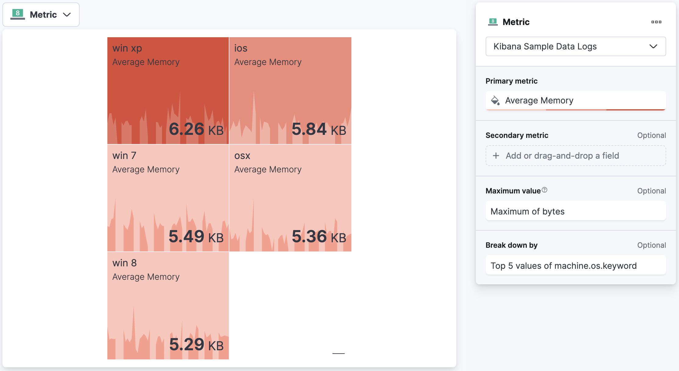
In the Lens editor, select Metric as the visualization type from the dropdown and drag the
bytesfield as the Primary metric in the layer pane.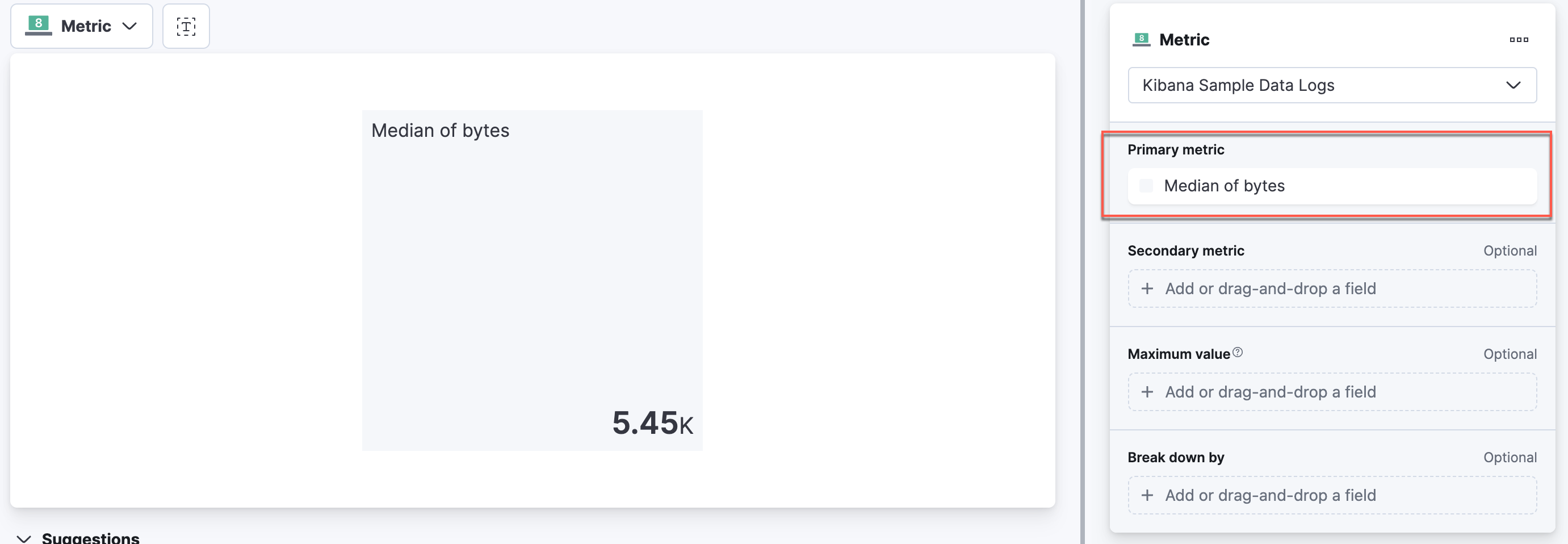
-
Kibana automatically selects Median of bytes. Click on Median of bytes to update the settings:
- Select Average from the Quick function list.
- For Value format, select Bytes (1024).
- Update the Name to Average Memory.
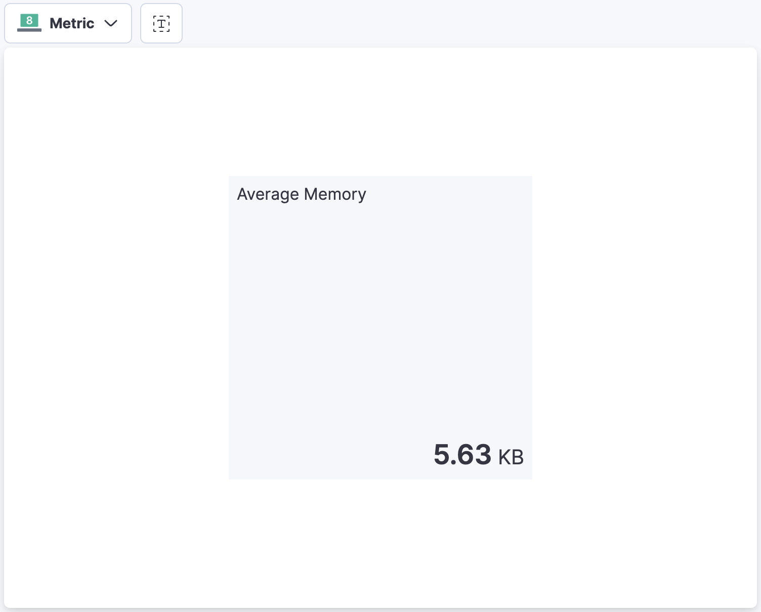
Click Close when done. Your visualization should resemble the below image, although the number may vary.
-
Next, let's add
machine.os.keywordinto Break down by. Notice that you will have values for every OS. Click Top 5 values of machine.os.keyword and change the layout columns to a value of2. Click Close when done.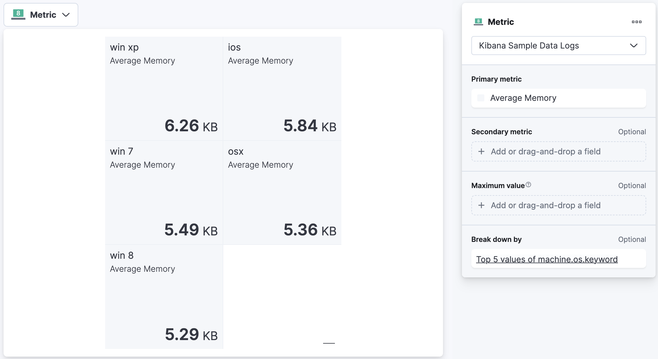
-
In the Layer pane, drag the
bytesfield to the Maximum value. By default, the maximum value is displayed as a bar on the left side of the metric.
-
Next, let's modify the appearance and other visualization settings of the Primary metric. Click Average Memory.
- Under Supporting Visualization, you can specify the type of None, Line, or Bar, as well as the orientation. Click Line.
- Under Appearance, set the Color mode to Dynamic.
- Click Edit to open the Color palette. Select the Negative palette. Note that the Color control will allow you to select different color ranges depending on the value of Maximum bytes. Leave the default values and click Back to close the color palette.
- When finished, click Close.
-
Lastly, drag the
memoryfield as the Seconday metric. Note that you can also change the name and format of this display to your liking.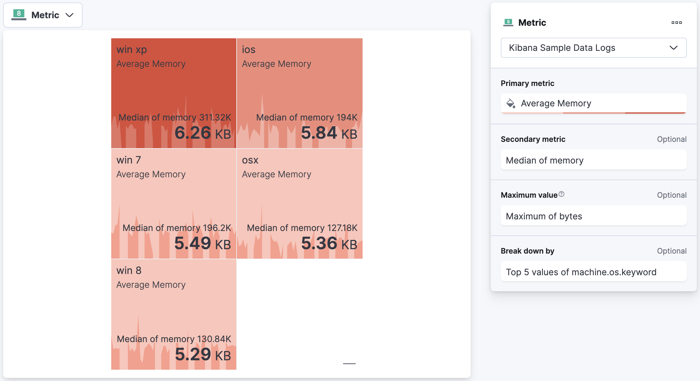
-
Click Save and return to go back to your dashboard. Click Save to save the dashboard.
Summary:
In this lab, you created a metric visualizations using a filter and a multi-metric visualization that presents data in a grid. You also created text visualizations using Markdown. In the next lab you will create tables.