4.2: Tables
Objective:
In this lab, you will learn about building tables using Lens. You will understand the difference between rows, columns, and metrics. You will learn how to create a summary row and set conditional coloring rules for cells.
-
Open the Logs Overview dashboard.
- Make sure to view the Last 7 days of data.
- Click the Edit button. Note: If the dashboard is already in Edit mode, you'll see a Save button instead.
-
Click Create visualization. This will open the Lens editor by default.
-
Let's create a table to show the top hosts being accessed most frequently showing host name, count of records and median of bytes. Click on Create visualization and configure it as follow:
- Visualization type: Table
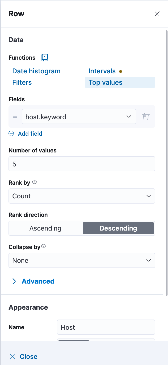
- Rows:
host.keywordfield - Metrics: Count
recordsand Median ofbytes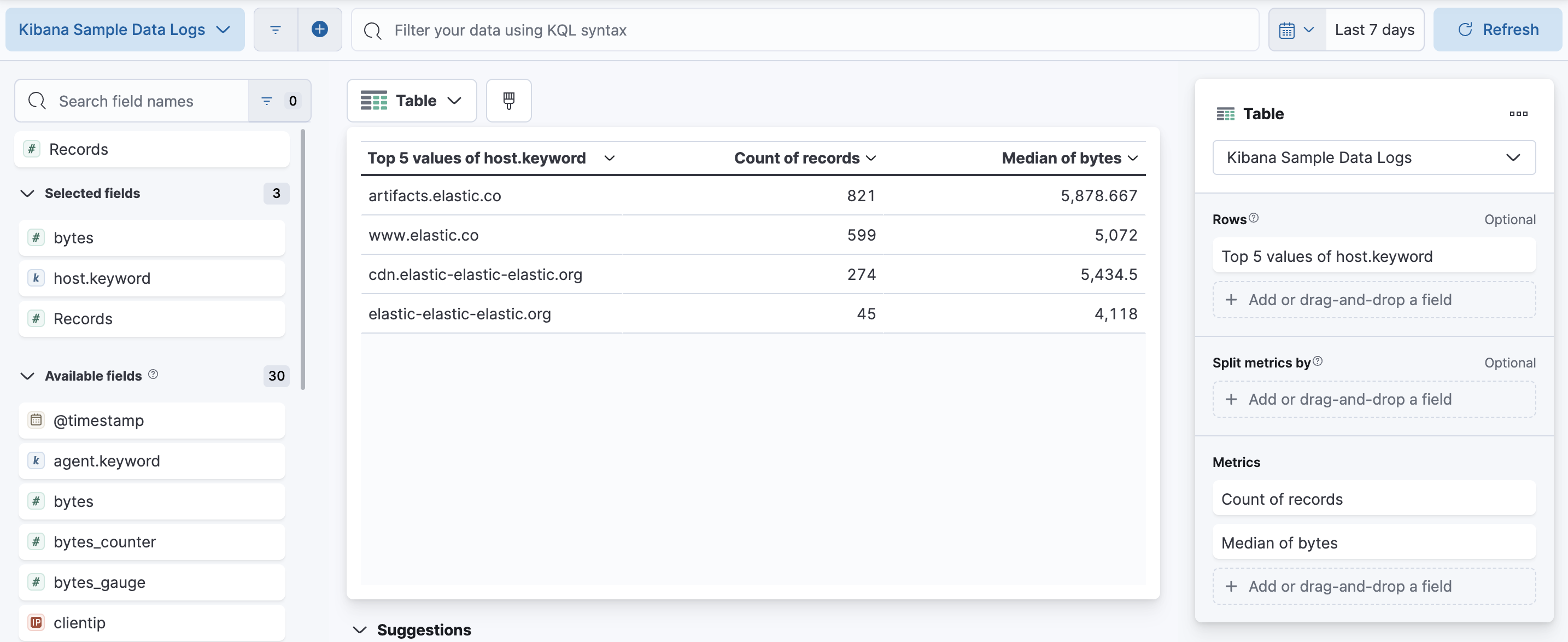
-
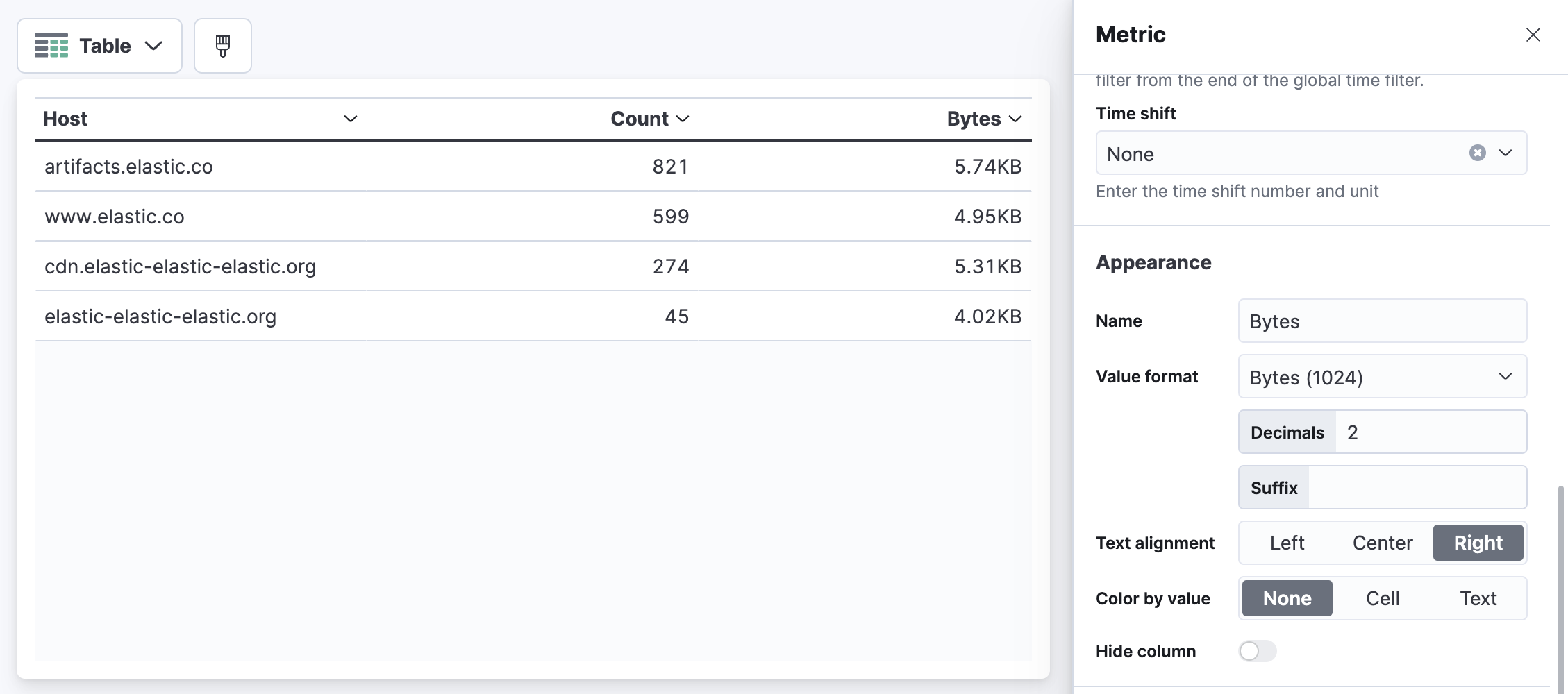
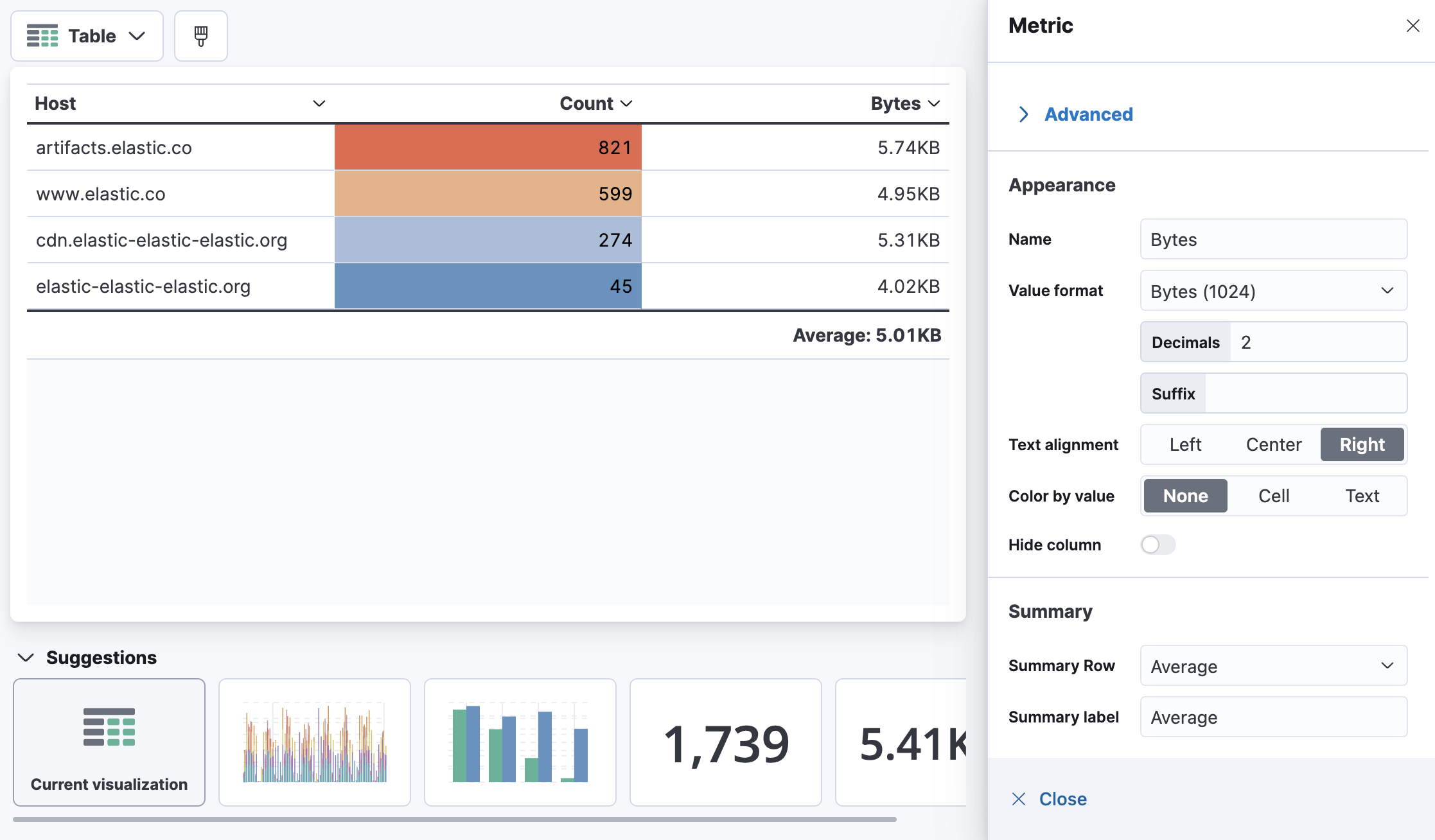
Change the titles of the columns to be Host, Count and Bytes respectively. Recall that you can change the titles by updating the Name for each field in the Layer pane settings.
-
For the Bytes column, let's also change the Value format to use Bytes (1024).
-
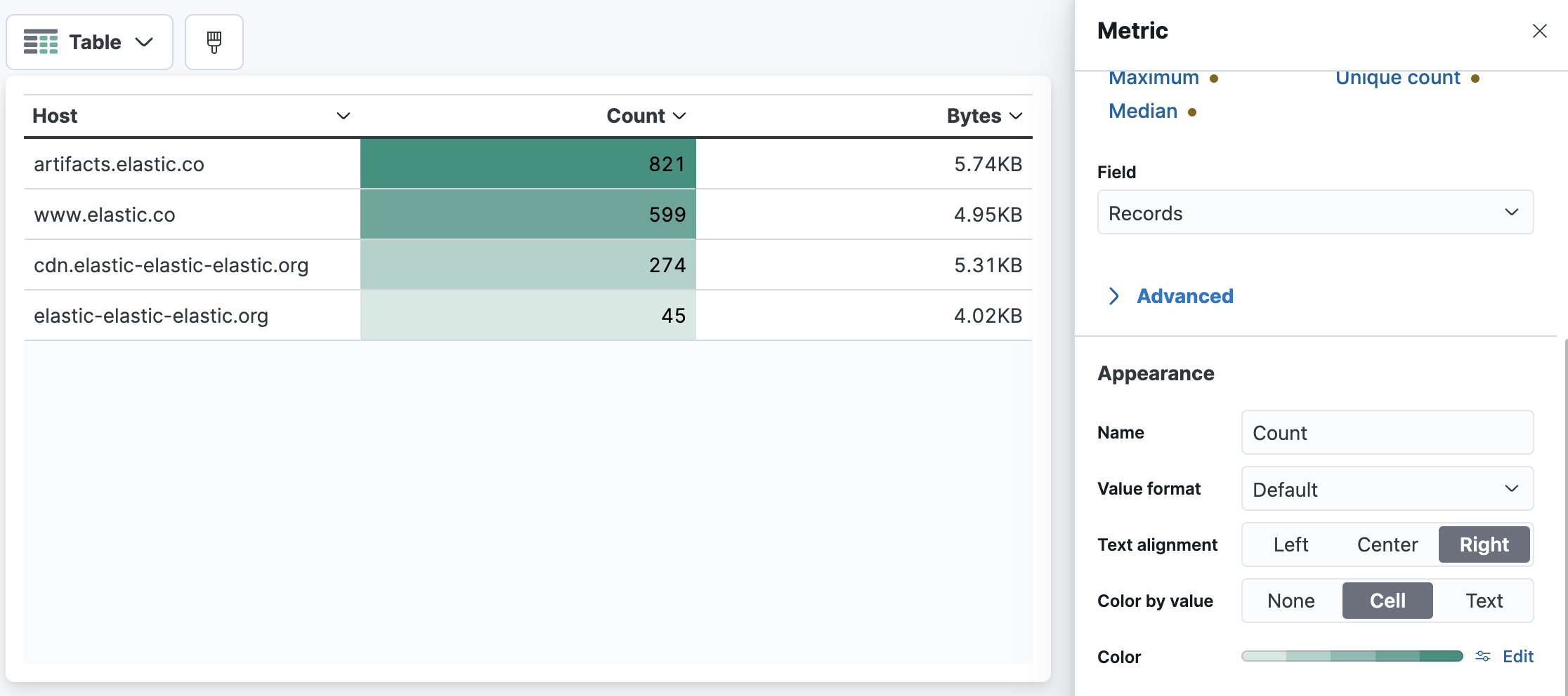
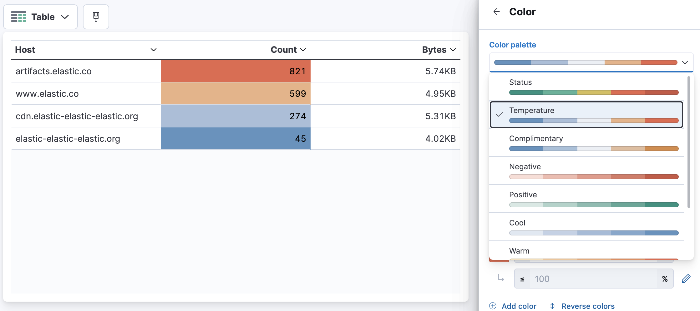
It's possible to conditionally color cells based on their value. Close the side panel, and click Count. Set Color by value to Cell.
-
Click Edit next to Color and change the color palette from Positive to Temperature.
-
Close the side panel, and click Bytes. Set Summary Row to Average.
-
Click Save and return to add the table to your dashboard.
-
Now, click [No Title] and name your table visualization as Top hosts. Click Save to save your table visualization name.

-
Finally, click Save to save your changes to the dashboard.
Summary:
In this lab, you have learned how to use Lens to create table visualizations.